Mobile-first design means creating layouts with the mobile screens in mind first, then proceeding to larger screens. For implementation, designers choose the right visual hierarchy, make elements thumb-friendly, use visuals with optimized size, and more.
Regarding how many people use mobile devices and for how long, a mobile-first design is critical to business success with your website or app. This approach ensures that your solution is functional and convenient for users. Thus, you will keep your customers and enlarge your audience.
This article discusses what mobile-first design is and how you can approach it to deliver the best user experience. Thanks to our expertise in creating mobile designs, we are eager to share insights on this. So, let’s see how you can implement this approach.
Mobile-first design definition
As the concept suggests, mobile-first design is when web designers start small and build their way up to a desktop version. This can be done by wireframing and prototyping for the smallest screens first and then moving to larger sizes.
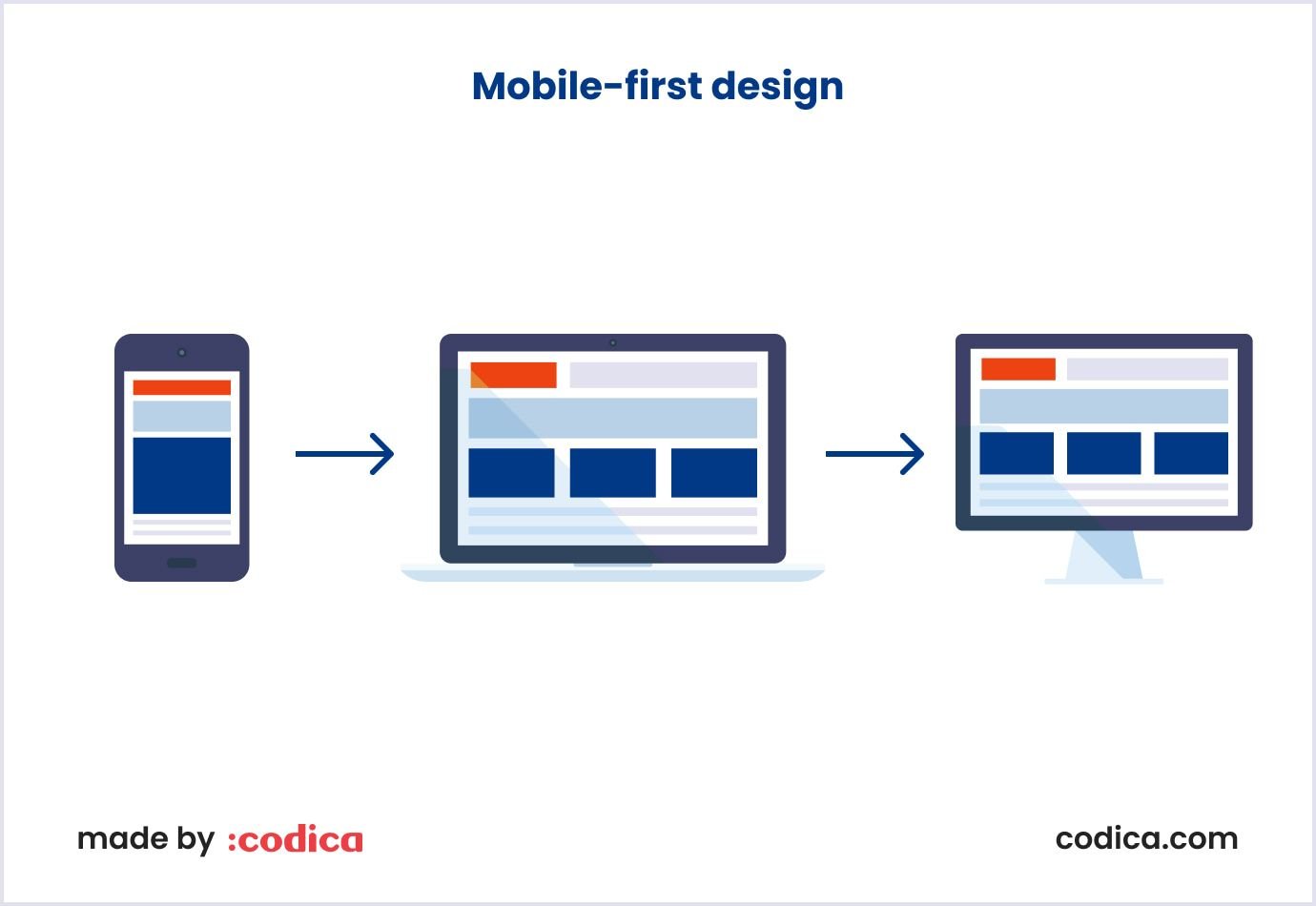
Making mobile screens a priority is sensible. This way, a designer can include the core features first and add more fancy functionality for larger screen sizes. Such an approach is called progressive advancement. The image below shows how mobile-first design moves from mobile to desktop screens by adding more design elements.
Importance of mobile-first design
Several factors make mobile-first design vital to operating a business. They come from widespread mobile device usage.
There are 5.44 billion people using smartphones as of 2023. It makes up 68% of the global population. This means a business can reach a wider audience by investing in the mobile version of their websites.
So, a significant portion of business and marketing endeavors went mobile. People view social media content, short videos, and podcasts on mobile devices. Content creators ensure user engagement and trust in your brand. This contributes to the use of social media ads by businesses that want to expand their online presence.
For example, smartphones create a stable flow of orders in retail. As of the last quarter in 2022, mobile devices created 74% of retail website traffic worldwide. Also, 63% of online shopping orders were made via smartphones.
Regarding these statistics, certain standards define the mobile appearance of the websites. For example, a mobile-friendly design is a must if you want your website to rank higher in search engines such as Google.
In Codica’s experience, we have had several projects where a mobile version was a priority for our clients. At the product discovery stage, our team learned that users would prefer a mobile design. So, we started the design for mobile devices first and then proceeded to the desktop version.
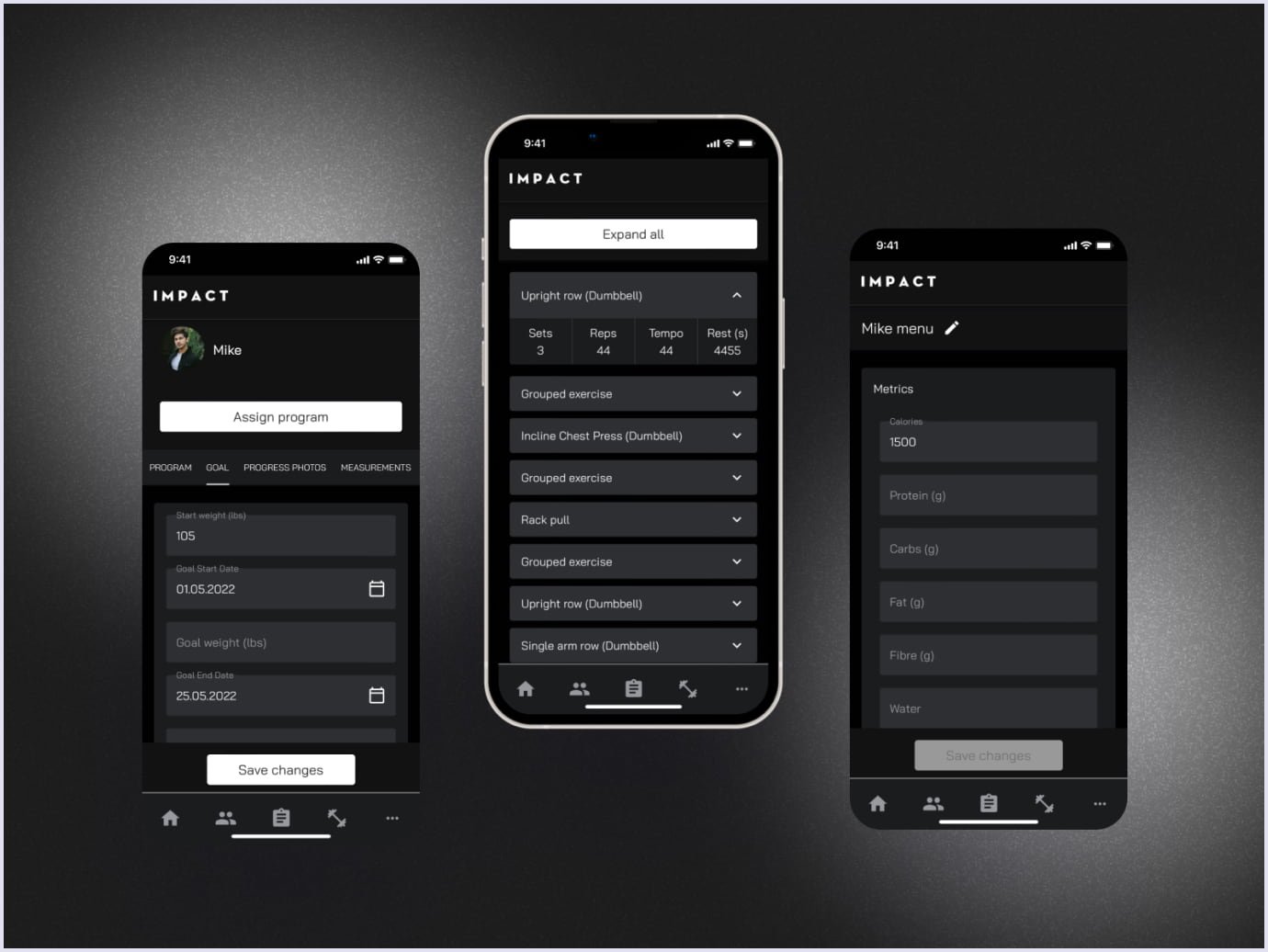
This is how we created a fitness progressive web application for Impact. It is a lightweight app that connects users and their personal trainers. Thanks to the PWA technology, the app is light and stable, processing a large amount of data. The app includes 400+ exercises, and customers performed 2000+ workouts with the app.
Seamless user experience design helps users navigate through the app and select their programs for workouts and nutrition with different parameters and categories. For example, you can enter your starting weight and goal, and the app will show your progress while you use the app over time. Also, the design includes interactive elements, such as checking if a user has reached their daily goals.
We used a black theme for the app user interface as the main color of the real Impact gym. Besides, it conveys the mood of determination to stay fit. Check the fitness app feel in the image below.
Implementing a mobile-first design
Creating a mobile-first design takes specific practices that ensure captivating results. Such practices are used to create mobile versions of websites and in mobile app development services. The steps essential to make your design responsive and mobile-friendly are as follows:
- Research;
- Wireframing;
- Prototyping;
- Designing user experience and the user interface;
- Testing.
Let’s see in detail what they are.
Research
Performing thorough research for design ensures that it will delight users. Careful planning is one of the factors for the project's success.
That is why, at Codica, we start designing mobile-friendly solutions from product discovery. During this step, the design team reviews the project's peculiarities, such as niche, target audience, features, and brand style. A vital part of the research is learning about end users’ problems and how the solution design can address them.
The step helps build a mobile-first design strategy to fulfill the requirements and tasks. At the end of the research, designers discuss their project vision with the client to align their views.
At this stage, designers create clickable prototypes to present the solution’s look to the client and development team. We discuss them in the sections below.

Wireframing
Armed with the research results, the designer creates the first sketches of the mobile-first design. These are wireframes presenting the layout of the future solution. It is like a draft map for a building, planning the placement of components.
Wireframes are typically drawn by hand or created with software tools. These include Balsamiq and Miro. Or you can use apps that also allow creating a full design, like Figma and Sketch.
Such software can show several options for the same element, like options for placing a button. So, the designer can select the best path per the project aim and design practices. Check the image below presenting a wireframe for a mobile app.

People engaged in UI/UX design services and development process benefit from wireframes in several ways. The client and project manager can check wireframes’ compliance with requirements. On the other side, developers get a preliminary view of how the elements are arranged. So they will get a clear picture of product development and give recommendations if necessary.
Read also: 15 Typical Web Design Mistakes Startups Make
Prototyping
Creating prototypes is the next step in getting closer to the final solution look. These visually present the solution elements and how they work together. The concept created with wireframes gets a single functional form. So, prototypes show how the solution will look and function.
A SaaS solution for the bakery we created is a good illustration of how prototypes differ for mobile and desktop screens. This platform offers services to order cakes and other baked goodies. The solution helps users to view and select items, schedule orders, and receive quotes. Moreover, it allows a business owner to view key performance parameter metrics. They include orders, requests, and total order amounts.
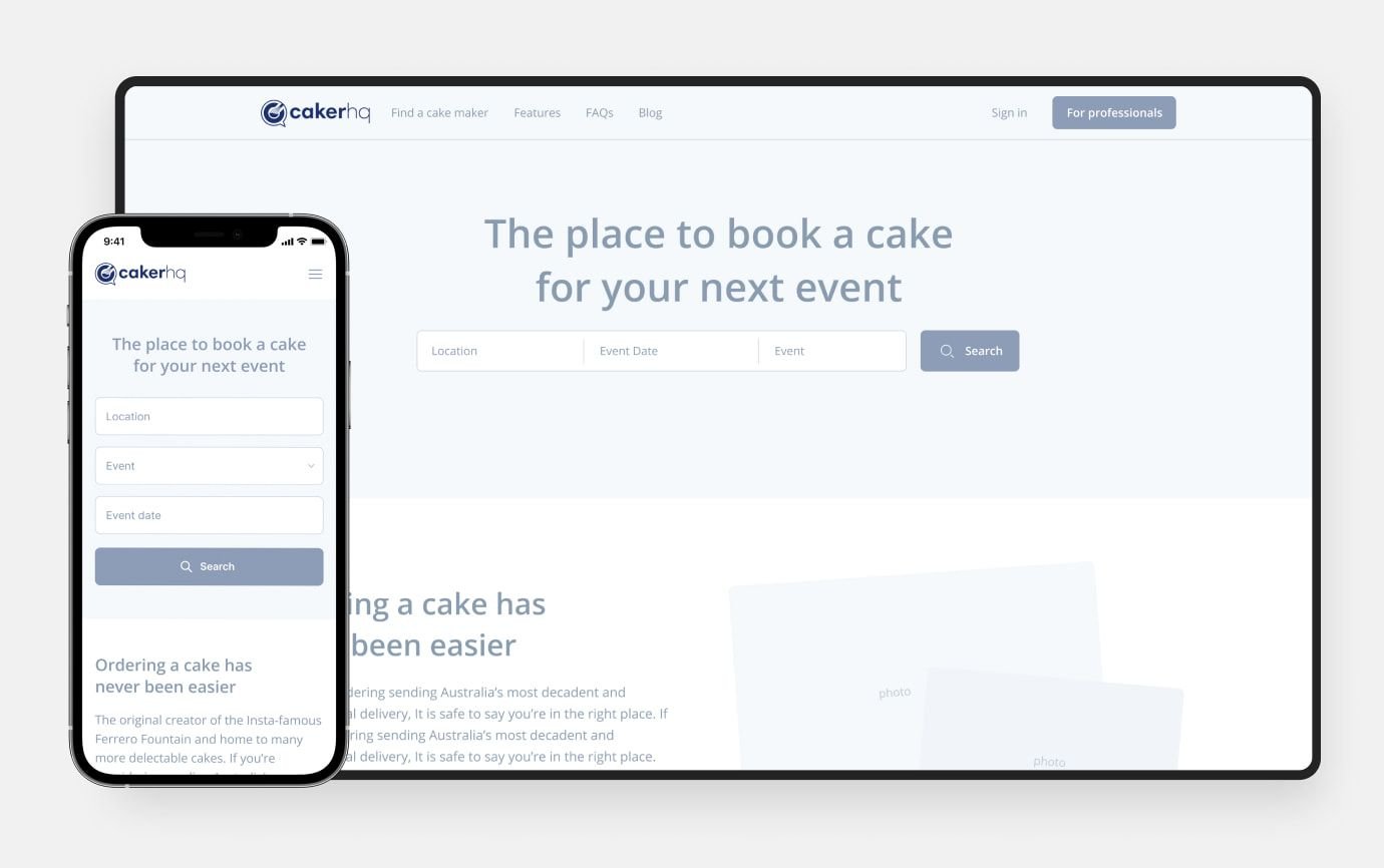
Our aim was to make the solution convenient for buyers and bakery owners. With this in mind, we included features with different accents in mobile and desktop versions. Our designers created a desktop version adapted to a caker who mostly uses a desktop to check their orders. And for users, who want to order the cake, we created a mobile version. That is because they mostly use their smartphones to find a caker and book a date for preparing a goody. Such an approach helped us deliver an equally rich user experience on both screen sizes.
Preserving the functionality, we rearranged the elements in the mobile version. For example, we adjusted calendar features for mobile screens compared to vast placement on desktops.
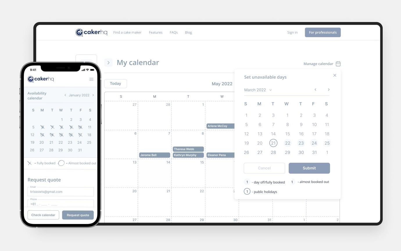
In the prototype below, you can see the two design options for mobile and desktop screens. Note that the mobile version includes the same functionality as the desktop one. This brings convenience to users who prefer to look through the solution on their smartphone or tablet. They get the same versatile experience as desktop users using their mobile devices.
Mobile-first design best practices
The basic principles of the mobile-first design process aim to optimize the layout with small screens first. Depending on this objective, designers rely on the principles that will bring the relevant result. Let’s see in more detail what those rules are.
Plain visual hierarchy
The placement of design elements by their priority to guide the viewer’s eye through the solution design is known as a visual hierarchy. It is reached by choosing the right element size, color, contrast, and arrangement. Here are the techniques that help build a visual hierarchy for users’ convenience:
- Changing the sizing of elements, making them bigger or smaller regarding their priority;
- Making elements contrasting to grab users’ attention;
- Choosing fonts for websites and pairing them with varying widths and weights;
- Using whitespace between elements to make the design visually clear.
Optimized UI and UX
These two design aspects, user interface (UI) and user experience (UX), are the pillars of smooth flow and customer engagement. It should be easy for customers to find and reach elements on the screen. For this, follow several fundamental principles:
- Choose conventional element placement. For example, the navigation bar is expected to be in the upper right corner.
- Make clickable elements large and separate them with whitespace to avoid unwanted clicks. Google recommends that the width and height of clickable elements make at least 48dp.
- Select a font size that is readable on mobile screens. For example, Apple allows the text font to be between 14pt to 19 pt.
- Place calls to action in the reachable screen areas discussed in the next section below.
You may also like: Top UI/UX Trends to Follow in 2023
Make elements thumb-friendly
Before deciding how to place elements in our design, we should consider the general rules of mobile device usage.
The survey shows that 49% of users hold their smartphones with one hand and use their thumb in 75% of interactions. The remaining users hold it cradled (36%) and with two hands (15%). So, users can reach certain zones of smartphones with more or less effort. The image below shows the areas you can quickly go with your thumb naturally, stretching or hard.
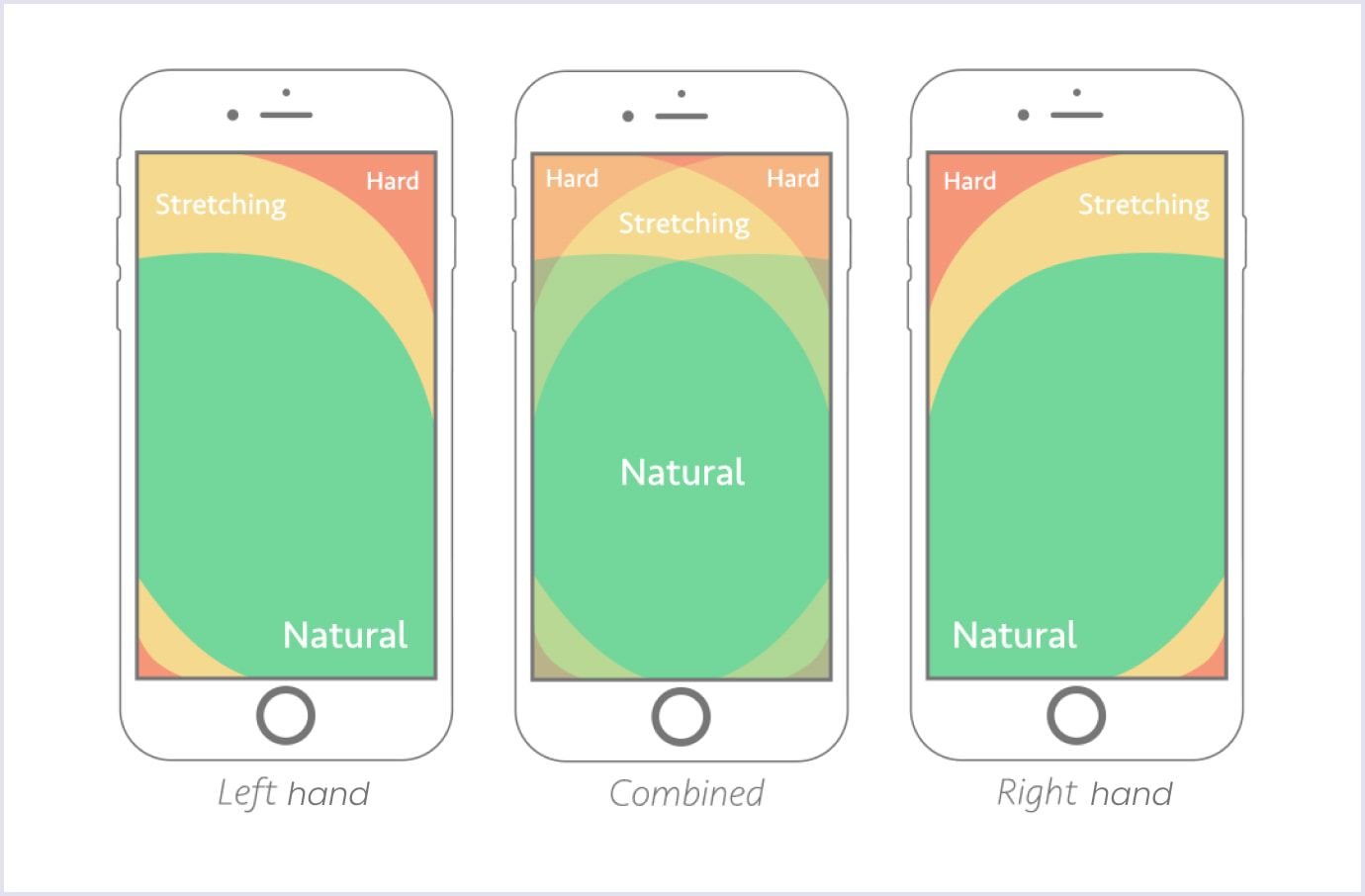
These data are used when creating the mobile first design with a suitable arrangement of primary and secondary elements. That is why designers try to place vital elements in the green zone of the mobile screen.
For example, the creators of the iPhone 14 Pro introduced the Reachability feature. It lets users lower the upper part of the screen for easier accessibility. Thus, smartphone usage is made more comfortable for people with difficulty using apps or navigating the web. The video below shows how to activate it on the iPhone 14 Pro.
Avoiding hover-only elements
Mouseover and hover are effects that change elements as the mouse hovers over. These effects are used for desktop designs. Meanwhile, the mobile-first approach should avoid them in designing interfaces. Instead, focusing on touch interactions, such as tapping, swiping, and pinching is reasonable.
Creating user-friendly popups
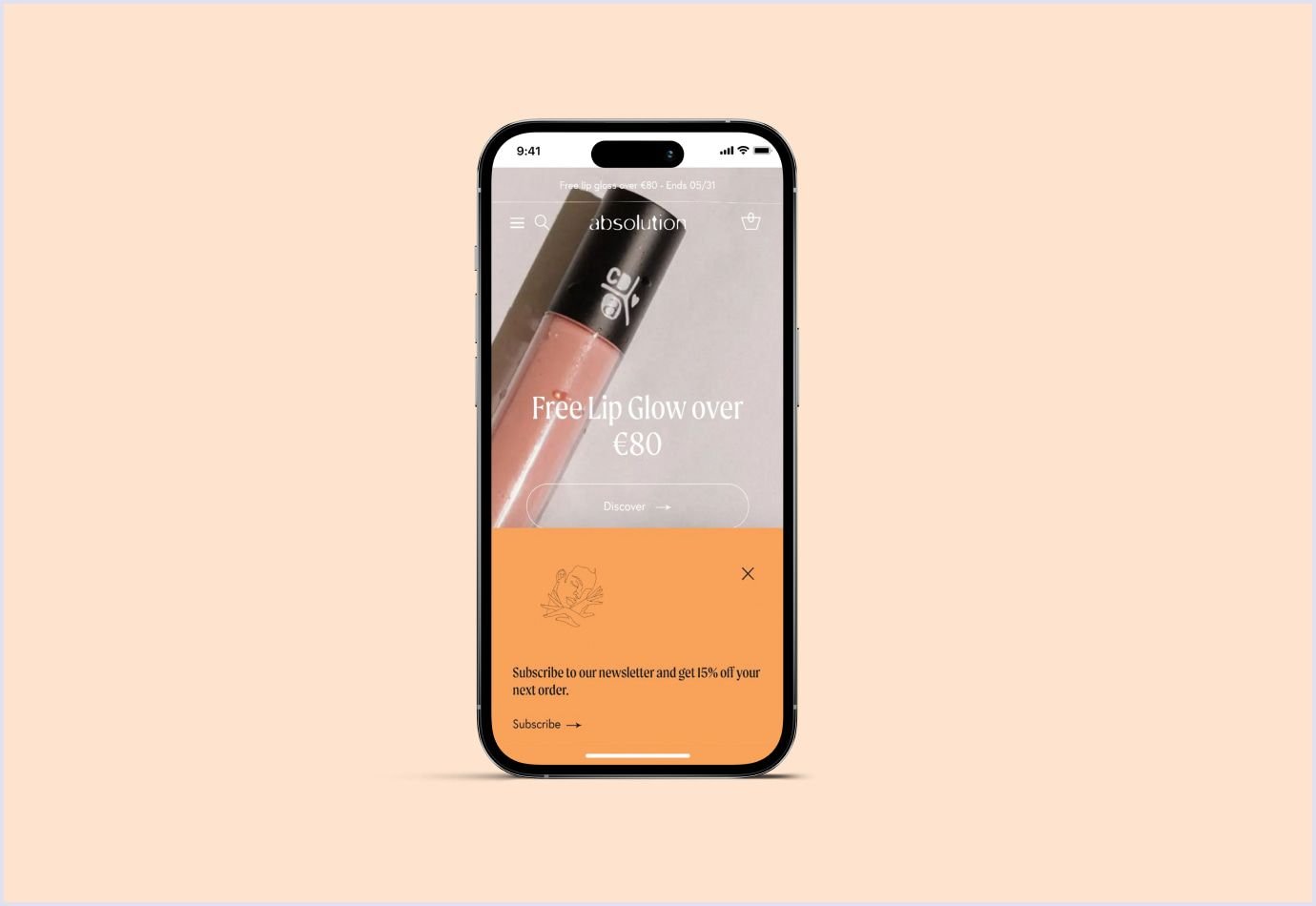
These are small dialogues used for informative or promotional purposes. They are also called interstitials. As Google puts it, interstitials and dialogues should not intrude on screens. This is because search engines will not be able to read the content. However, you can create unintrusive screen dialogues that cover only a part of the mobile screen.
Also, you can create popups so users can quickly get rid of them. For example, with Popupsmart builder, you can create a popup that disappears when you tap outside it on the screen. Also, you can add an element to close a popup. Check how Absolution Cosmetics weaved a popup in their mobile design in the image below.
Using visuals with optimized size
Graphic elements influence your web solution performance. Why is it crucial? Because hindered loading speed can result in a high bounce rate. You have only 2.5 seconds to load the heaviest element on the page to make your solution user-friendly.
For optimizing graphics in your design, you can choose lightweight formats, such as PNG, JPEG, and GIF. Also, you can compress images. Compression of 70-90% gives a balanced result regarding weight and quality.
Further reading: Website Redesign: The Complete Guide and Recommendations
Mobile-first development
After creating the design, the team proceeds to development. This stage involves bringing the solution to life by implementing essential features. So, developers think over the following for the mobile solution.
Front end and back end
The front end includes versatile interactive user experiences involving network connection with the backend. This part shows the designed UI and UX and how users move through the solution. Also, the front end includes approaches to make the solution load fast with cookies, forms, animations, and more. For this part, we use JavaScript, TypeScript, and React Native as proven technologies for reliability and scalability.
The backend side ensures the work of mobile solution functionality. At Codica, we use Ruby and Ruby on Rails to create the back end of mobile apps and websites. These technologies ensure that the solution is lightweight and fast.
Along with that, we also use Node.js, which is perfect for data-intensive solutions.
It is also vital to use the right teamwork approach in development. The Codica team uses agile and values it for the flexibility it ensures. With agile, our team moves in sprints and can implement changes to the project easily. Combined with daily and weekly meetings, this approach makes the development of mobile-first solutions efficient and streamlined.
APIs and integrations
The application programming interfaces (APIs) and integrations allow for communication of the front end with the back end and database. Developers create scalable and secure mobile solutions by choosing the APIs with proper encryption.
At the same time, integrations enrich the solution with additional capabilities. For example, at Codica, we use Stripe for payments, Sendgrid for email delivery, and Twilio for communication.
Database
This element of a mobile solution stores and handles large amounts of data to make them accessible to users. Databases help store and process information safely. The Codica team prefers PostgreSQL thanks to its extensibility and helpful features.
To sum up, the mobile app or website development process involves thorough work and close cooperation between the development team and designers. Such an approach ensures that the teams implement the principles of mobile-first design and requirements from a client.
Testing mobile-first design
The above points help us to create a mobile-first website design moving from essential elements to more complexity. Testing and quality assurance services are the next vital step. It reveals hidden discrepancies or bugs leading to the solution’s inappropriate behavior.
Regarding the abundance of testing techniques, we review a few critical for mobile-first design in this article. So you will understand how testing helps deliver a better user experience on mobile devices. Let’s discover how we can refine our mobile-first web solution with testing.
Testing with real device cloud
If you want to save time and costs on testing the mobile-first design across different devices, using a real device cloud is reasonable. This environment provides thousands of screen sizes for mobile devices and desktops for testing. You can use this medium to check how your app or website design renders across different screens.
One such tool is LT Browser 2.0. It is free to use and provides special features for mobile-first and responsive testing. So, how can it help in testing? Let’s see.
- 50+ screen sizes to help testers see how a website will render;
- Simultaneous debugging for different viewports with specified devtools;
- Hot reload support with automatic URL reload in different viewports;
- Testing on low and high network conditions;
- Sharing results with the team.
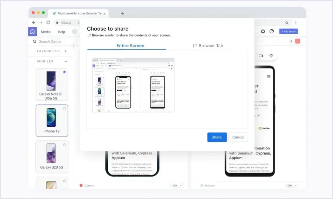
Moreover, you can generate performance reports. The tool integrates with Google Lighthouse to help testers get website performance data. You can view the metrics on performance, accessibility, search engine optimization, and more.

Cross-browser testing
This process shows your website's performance on different browsers, operating systems, and resolutions. With an overwhelming number of screens, this process is performed with cross-browser testing tools. They help test a website by looking for a specific browser or operating system, such as BrowserStack and Headspin.
Validating HTML and CSS code
After cross-browser testing, there can be warnings about errors or missing elements. These might be syntax mistakes in the code. It is vital to eliminate them as they can cause trouble when you proceed from a mobile design to a desktop. You can use the tools for validating HTML and CSS code to catch them. For example, check out the Nu HTML Checker and Markup Validation Service from the World Wide Web Consortium.
A/B testing
Generally, A/B testing shows two options of a web solution element, such as a button, to different users simultaneously. So, you can see which variant brings more positive feedback and improves business metrics. The winning option of your mobile-first web design can optimize your website.
Also, you can use A/B testing data to understand user behavior, engagement rate, pain points, and satisfaction with your website. Using these data, you can drive your revenue.
For example, Hospitality.net was still determining if they should introduce more or less rich screen features. When the company conducted A/B testing, the result showed that the fuller version for bigger mobile screens wins. Thus, the company increased the conversion rate by 30%. Check the image below for both versions.

Usability testing
This is the final step in finishing the testing phase. Usability testing is conducted with real users who are the target audience of your website or app. During these tests, you can ask users in person. Another option is to send them a questionnaire and get their results later. Usability testing uncovers peculiarities of users’ interaction with design elements. So you can choose the right path to improve your website or app relying on usability principles.
By the way, you can discover more about each of the above-listed stages of creating a design in our exciting guide to mobile app development.
Mobile first design examples
Seeing real-life examples is the best way to understand how mobile-first design works. Let’s discover what they are and how they implemented a mobile-first approach.
Puffin Packaging
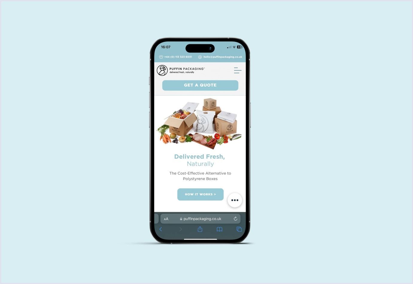
This is an eco-friendly company offering temperature-insulated packaging. With its website design and content, the company promotes its vision. They efficiently use design hierarchy and CTAs on their first page. The first CTA, Get a Quote, takes visitors directly to the company. The second CTA, How It Works, is less visible and refers to how the packaging process goes. Putting their contact information in the upper part helps visitors easily connect with the company.
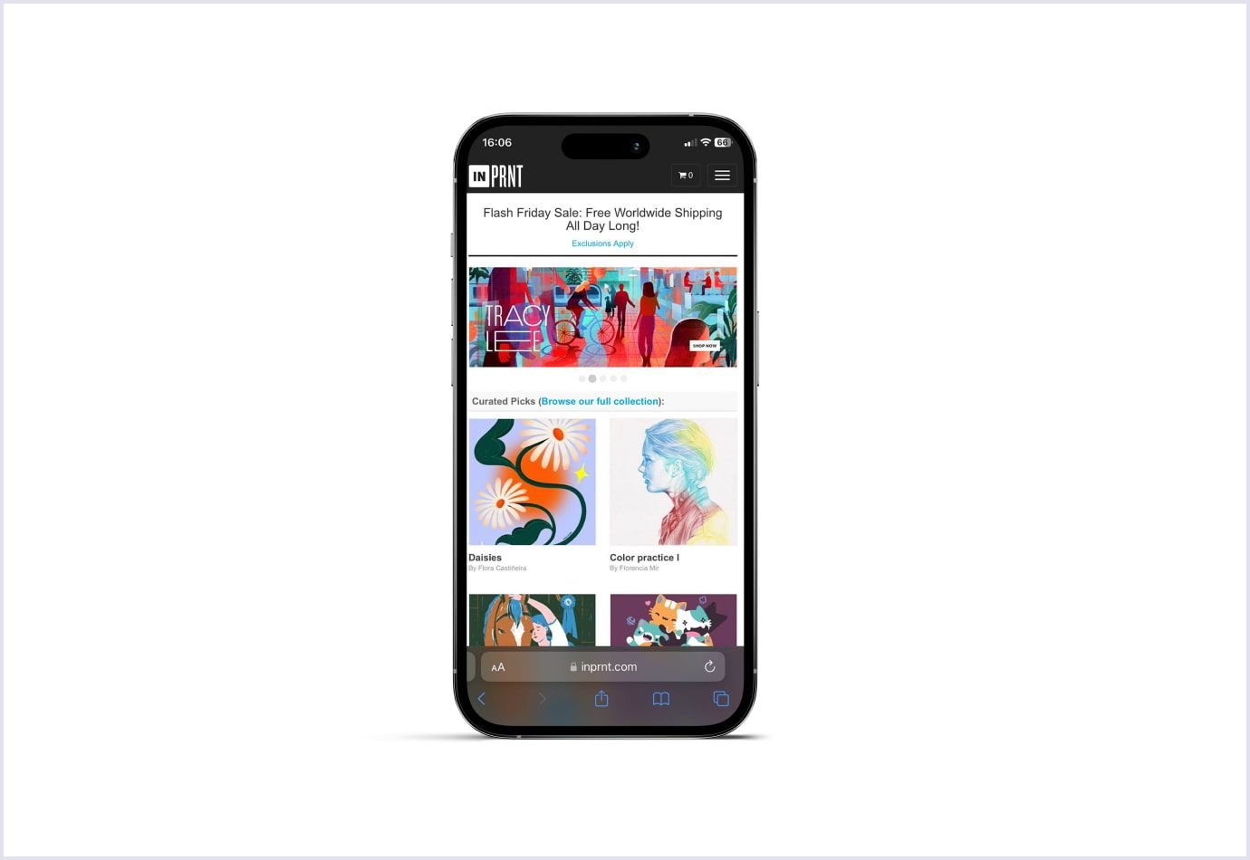
INPRNT
The company offers a full cycle of services in making prints. They engage talented artists to open their stores and create unique collections for customers. So, they have the mobile space to present print samples from various artists. The hero section is also engaging. It encourages visitors to look closer into collections and go for buying.
Yang’s Place
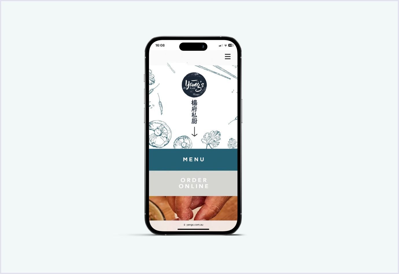
The Chinese restaurant website starts with a logo and a fully branded page. The design then leads to two main things: menu and order online. A minimalistic approach to placing elements helps users to reach their goals easily.
Benefits of mobile-first design
The mobile-first approach is the future of web design. This approach brings an excellent experience to your users. So, it is one of the best investments you can make for your business. Let’s see what benefits you can get with mobile first design.
Prioritized website or app design elements
As mobile-first design prioritizes small screens, you think of the core elements initially. Deciding on the components and content this way makes your solution consistent and intuitive for users.
Generating more website traffic
According to Statista, mobile devices generated 58.33% of global website traffic, as shown in the image below. This is a steady increase during the past 8 years. So, when you consider mobile design your priority, you cater to your target audience. Thus, you get more traffic to your solution.

Improved optimization
The loading speed and mobile-friendliness are two characteristics that Google rewards. Thanks to them, solutions rank higher on the search engine result page (SERP). With a mobile-first approach, your page will load faster, ranking higher in browsers.
Contributing to user engagement
Nearly half of smartphone users spend 5-6 hours daily on their devices. That’s because you can use them on the go and view information casually. A mobile-first design will compel users to visit your website or download your app.
Getting leads from social media
Around 4.74 billion people use social media globally. And a significant share of those users apply their mobile devices. For example, YouTube sees twice as many mobile users on different pages than desktop users. This means that people interested in social media ads will likely arrive at your website's mobile version. A mobile first web design will delight them with a refined experience creating an excellent first impression of your brand.
Best tools to use for mobile-first design
With specific tools, you can make it easy to create mobile-first designs. The tools help create and test the vital aspects of your solution. So, let’s see which tools you can use for mobile-first design.
Justinmind
If you want to create high-fidelity and interactive prototypes, check this tool. The tool offers over 500 ready-made UI elements, basic interactions, screens, and prototypes. Justinmind provides a full range of interactions both for desktop and mobile screens. So, you can simulate swiping, tapping, scrolling, and pinching with the tool. Also, you can test the prototypes for responsiveness and motion on simulators of iPhone, iPad, and Android devices.
Figma
This tool helps with any elements designers want to implement. With Figma, you can create prototypes and design websites. You can choose from numerous screen sizes that depict how the web page will look. Besides, it has features for brainstorming with FigJam and team collaboration. Also, Figma allows easy access to layouts for developers. So they know how to implement the design.
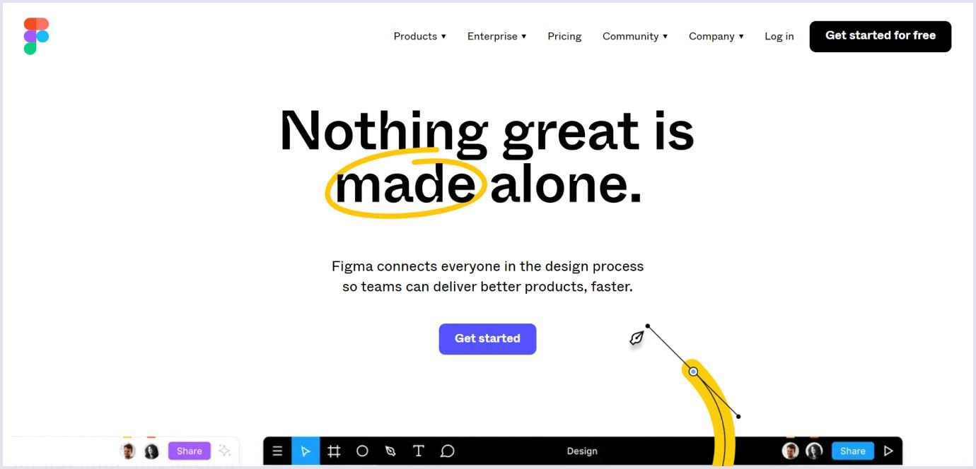
At Codica, we appreciate this software’s versatility and use it to build mobile-first designs.
Adaptive Images
This lightweight solution optimizes images for mobile-first design. It detects the device’s screen size and then adapts the image with the best resolution. With the tool, you can automatically see the device's screen size, reduce the image size, and customize image quality. You can use this tool for free as it is an open-source project on GitHub.
Google’s mobile-friendly test
It is a tool to validate that your design performs well on mobile devices. It checks vital characteristics like loading speed, responsiveness, and usability. As a result, you get detailed reports with data and recommendations on improving your web solution. The tool is free. You can insert a URL of your website to check it with the test.

Mobile-first vs responsive design
Creating a mobile-first design does not imply that it will be responsive. Several features distinguish these two approaches in design.
Mobile-first design means starting from small screen sizes and moving to larger ones. This approach means adapting to mobile screens and making the design responsive. Meanwhile, responsive design is only sometimes mobile-first.
The mobile-first design is based on elements prioritization with a clear visible hierarchy. On the other hand, responsive design is not necessarily based on prioritizing design elements. It aims to detect the device’s screen size and shift content to adjust it to its viewport.
In the table below, let’s review the difference between mobile-first and responsive design.
| Mobile-first design | Responsive design |
| Progressive advancement, moving from smaller screens to larger | Graceful degradation, creating the desktop version adaptable to mobile screens |
| Prioritizes content and design elements to optimize the design for mobile screens | Created as a one-size-fits-all content and design using breakpoints to fit groups of mobile devices of specific sizes |
| Best works on mobile devices | Best works on desktops |
Codica's experience in creating mobile-first design
When clients turn to us for a design or full-cycle development, we approach the projects with mobile screens in mind. Given the widespread usage of mobile devices, mobile design is a priority.
When designing mobile screens, we preserve the rich functionality that a client wants to include. This applies to all solutions we create, such as marketplaces, SaaS, or PWA.
Our team uses the best design and mobile usability standards to make solutions convenient for mobile users. We think about the suitable placement of design elements and visual appeal. Thus, we improve their visibility on mobile screens of different sizes.
Also, we follow the principles of accessibility. So we choose the right areas of the smartphone to ensure easy reach for users with different abilities.
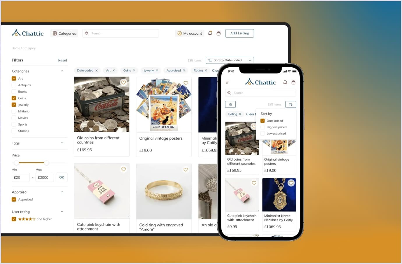
For example, this was the case when designing the mobile version of the marketplace for selling collectibles. The design for this marketplace app development started from the research and ended in creating its brand style. A portal lets you list, buy, like, and share information on collectibles.
Thanks to our endeavors, the mobile design holds the features that ensure a smooth experience with the platform. The design allows listing items, uploading photos, and sharing pieces. Intuitive search helps you to find collectibles by choosing the needed filters, such as product title or category.
Despite numerous items displayed, the images are visible, with enough space for tapping and scrolling. So, users can search and view information about the pieces on the go with convenience. Check the image below to see how the search menu and pictures are arranged on the desktop and mobile screens.
Wrapping up
Mobile-first design holds many aspects critical to delivering a refined user experience. Designers consider the element arrangement and keep accessibility in mind. They also think of how people hold smartphones to reach the needed areas. With this approach, mobile solutions become functional and easy to use.
As smartphones are widely used, thinking over mobile design is critical for a business to thrive. This approach ensures that your solution delights users with appeal and convenience. So, you reach a broad audience with a mobile solution and get opportunities for mobile promotion.
We are eager to create a mobile-first design if you have a project in mind. Check our portfolio to see how we designed projects for mobile screens. For details and a free quote, feel free to contact us. We will be glad to answer your questions.


