Innovations are the foundation for software-as-a-service (SaaS) products. Each SaaS company aims to delight users with elaborate solutions and high technologies. Thus, cloud applications make users’ work and daily tasks easier.
However, the value of a SaaS product may not be evident to your audience. An important aspect that shows the value of cloud software is its excellent design. A convenient and delightful solution creates a great impression and improves the conversion rate. Thus, the design helps your marketing endeavors and benefits your business.
This article overviews trends and best practices in the SaaS design process. Knowing them, you can improve your cloud solution design and win users’ trust.
Why is SaaS product design important?
The SaaS industry keeps evolving, and it is more challenging for newcoming businesses to win an audience. One of the critical aspects that help in this situation is design. For example, McKinsey research shows that companies presenting with great designs have higher revenue growth.
A designer understands the business value of each solution they create. So, they use visual (user interface) and structural (user experience) tools to convey that value to users. Designers differentiate your SaaS app with UI/UX design aspects, which helps you stand out from the competition. Thus, the design also positively influences the marketing strategy.
Another crucial point is that SaaS product design dramatically impacts user experience. The look and flow of your cloud solution are the primary things a customer faces when interacting with it. The better your UI/UX design, the more likely people will stay with your product.
SaaS design trends
Today, SaaS has become vital in most businesses and continues to influence the market. Thanks to the design, cloud software improves workflow and operations for companies. The best SaaS products use plain yet vivid elements and colors that help users in their daily activities.
So, let’s dive into the prominent trends SaaS companies follow in designing their products.
Clean design
As a SaaS app development company, we know that simplicity is crucial to your SaaS platform’s design. The more approachable your design is, the better user experience you will provide. Therefore, your acquisition and retention rates will be higher.
A clean cloud solution and web design mean a convenient arrangement of elements. Such a design for SaaS has a direct focus on the needed functionality enabling users to understand it in a short time. Simplicity engages users, making them more likely to stay with your SaaS product.
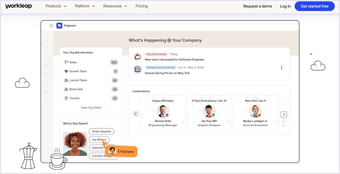
For example, Workleap, employee experience software, uses this method in its design. The platform applies a minimalist approach to the usage of elements and colors. So, the layout leaves space on the page to present the necessary information.
Source: Workleap
Minimalism in colors
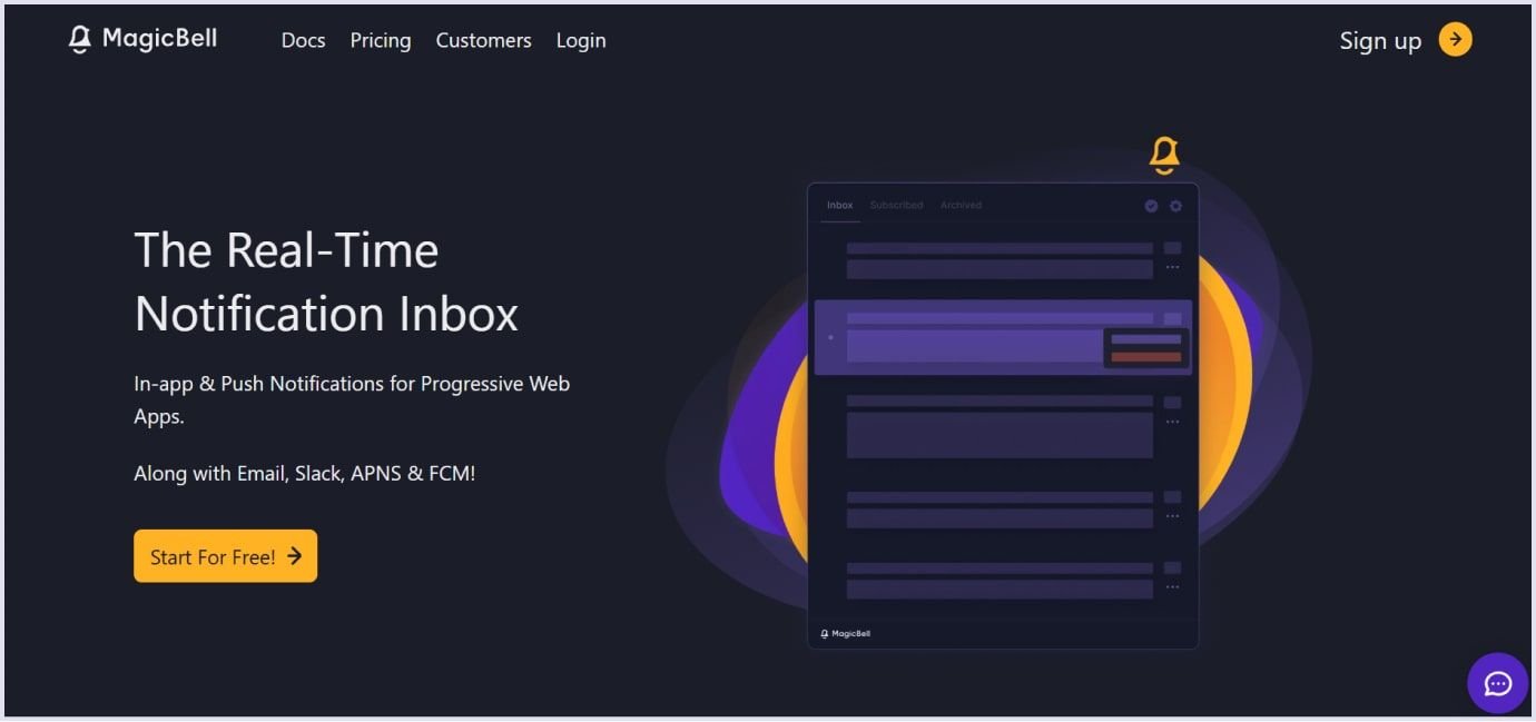
The approach to the color palette in SaaS design has shifted to minimalistic use. Websites and apps tend to drive attention with vivid colors but use them in a few elements. The SaaS product design includes using primary brand colors and accents with other colors. Typically, accent colors are used for call-to-action buttons and navigation and are kept to a minimum.
Using two complementary colors and white space for accent has become widely used in web design. It’s easy on the eyes, so users can view your content without being distracted. For example, MagicBell uses orange and dark blue as primary colors.
Source: MagicBell
Massive heading fonts
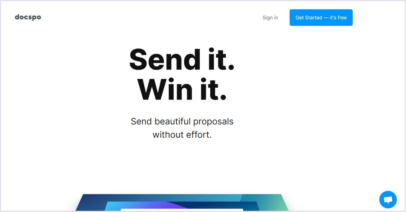
Typically, SaaS web design uses large, bold fonts in UI/UX. That is because it must be apparent to the user what value your product has. Thus, users will make informed decisions. As your SaaS product is rich in functionality, bringing up the essential features from the start is vital.
The section in bold brings up its importance, highlighting the primary information about your SaaS app that must reach the user. Depending on the vividness of each section, you can use different font sizes. More vital user interface areas will be highlighted with bigger fonts. Meanwhile, the smaller font is used for secondary components.
For example, Docspo takes the best of applying big font to create a clear and impressive message.
Source: Docspo
Supporting graphics and illustrations
When presenting your cloud-based software, you must make it appealing and structured for the user. The best way to do so is to use graphics and illustrations. They help you to do the following:
- Attract attention with visuals. Through graphics, you make your website more appealing to users. Graphics help you improve the overall look and feel of your SaaS app.
- Show information and content. Graphics and illustrations convey information to users. Thus, you can bring up the product's value to your target audience.
- Highlight the product’s credibility. Compelling graphics highlight the relevance and professionalism of your software as a service.
- Improve usability. Illustrations accompany the functionality and help users move through your SaaS product.
Graphics, illustrations, and photos you use should be custom. Try to avoid stock pictures. It is better to use the practice of famous companies taking photo sessions and applying custom design to create a unique touch to their cloud solution. Skillful photographers and designers help you bring a distinctive look to your software.
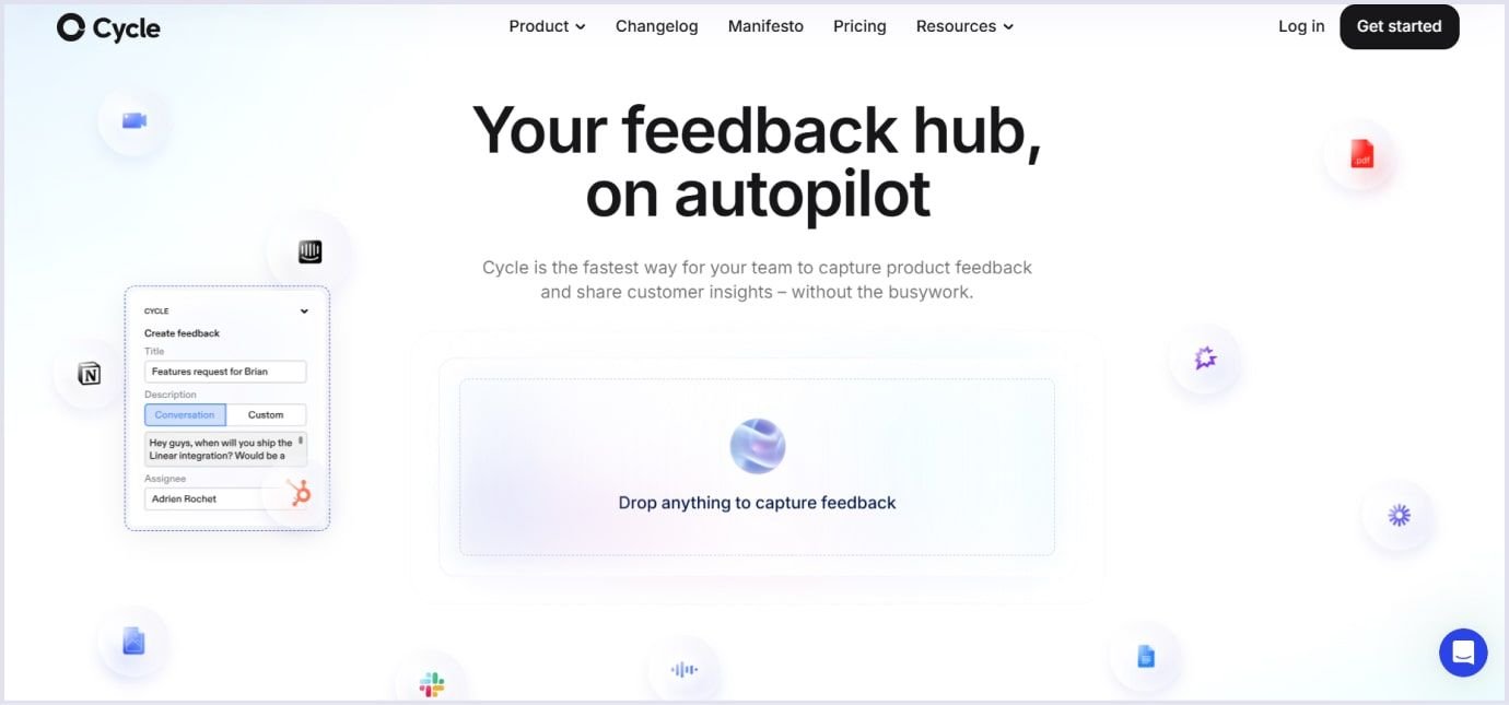
Cycle is a great example of using custom graphics to present their exceptional solution that follows the prominent UI/UX design trends for SaaS. Check out their website to see how they added graphic elements and interactivity to present their SaaS app.
Source: Cycle
Graphics highlight your brand identity. Each page uses your brand colors and style. So, a user understands that now they are with your cloud solution.
Micro-interaction elements
Micro-interactions are small, easy, and fast user experiences. They act as fragments of longer journeys and include swiping, scrolling, or pressing a button.
Creating the design of micro-interactions is not about the development of new interface functions. It is about showing the existing features in a short form. This way, a user will understand the main functional flows of software as a service.
Micro-interactions give feedback on users’ actions with your product. For example, changing button styling when clicking the mouse shows that the process is on the run.
And one more important thing is bringing user delight. You can add fun to swiping interactions and make your app more humane. For example, below is an image showing micro-interactions in the design of Structured when a user strikes out a completed task.
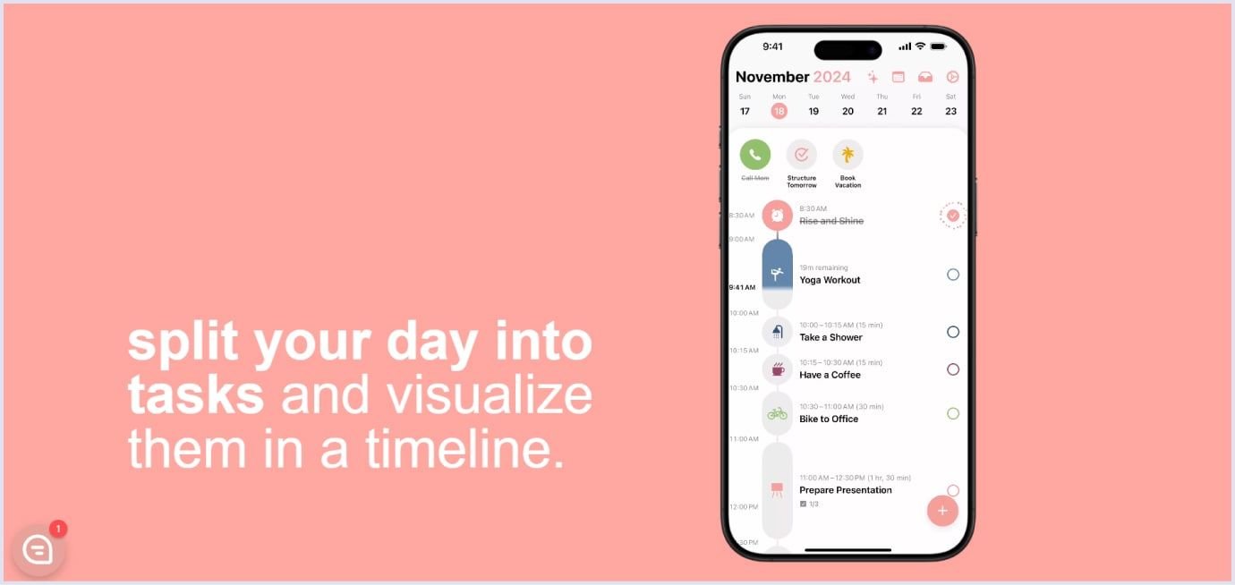
Source: Structured
You may also like: Progressive Web App Design: 9 Tips for Great PWA UX and UI
SaaS design best practices
Your solution will win more users if you create a thoughtful and delightful environment to use it. You can achieve this by relying on the best practices for SaaS product design. Let’s see what they are to make your SaaS user-friendly.
Easy sign-in and sign-up
Signing up is when a user decides to use your software after weighing other options. So, the registration process should be as simple as possible. Collect only the most critical information, such as the name and email address. You can also ask for more information but try to keep it as short as possible.
For example, the below example of a sign-up design for the Help Scout SaaS is plain and easy. Additionally, it highlights a simple progress to visualize the number of steps in the sign-up process.
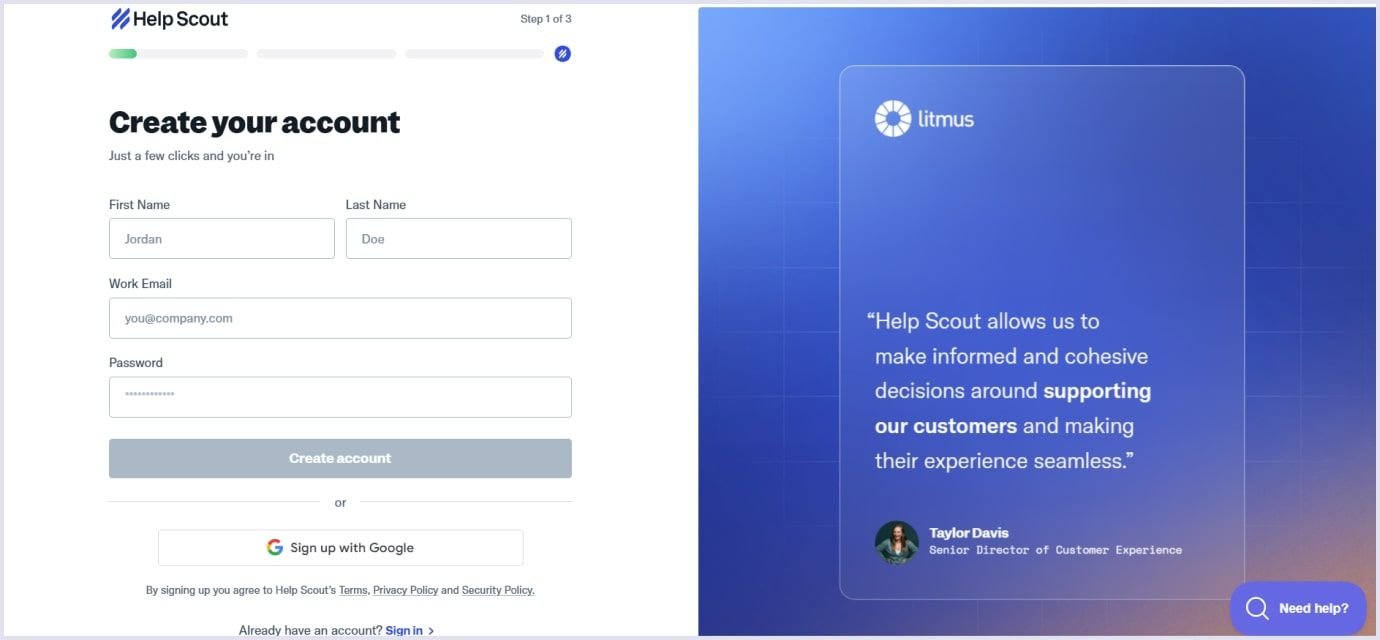
Source: Help Scout
Creating a vivid call-to-action button is an excellent way to involve more users in the sign-up process. It may also specify that registration is free for users if you offer a free trial. Still, users may expect you to ask for credit card details when they get started.
For example, the Google Workspace website asks for the name, email, and company domain to sign up a new user. The landing page contains two call-to-action buttons making it visible for users where they can start with the product.
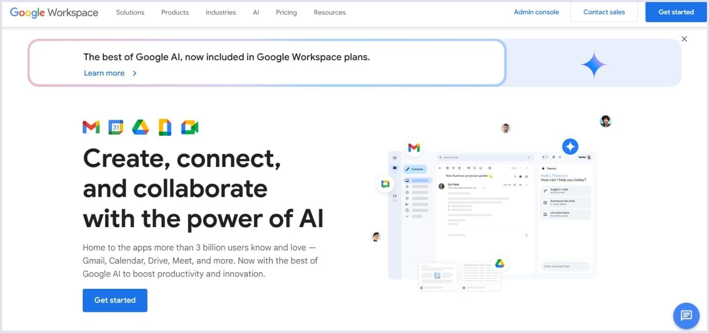
Source: Google Workspace
User-friendly onboarding
The onboarding process shows new users how to get started with your SaaS application. It includes showing the functionality of your product and the benefits that users will get. To make things easy for users, keep your software as a service elements and functions simple and clear.
The onboarding process varies for each software as a service, depending on its complexity. Onboarding involves a product tour, education on features, and accomplishment of tasks. The main goal of the onboarding process is to prompt users to activate your product.
Another vital point is that the more complex your cloud app is, the more user-friendly the onboarding process should be. It allows you to help users understand your solution and raises the stickiness rate.
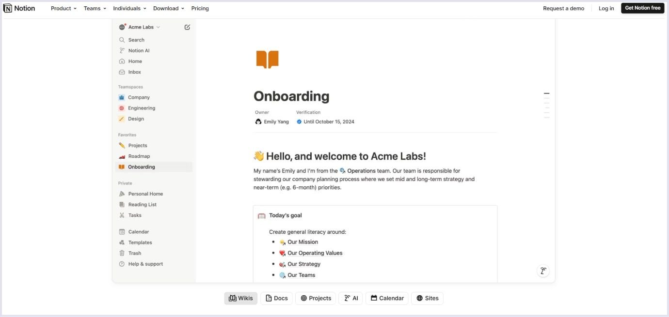
For example, Notion, a collaborative and productive SaaS app, offers a tour on the Onboarding page. The platform uses simple graphics. It shows the essential functions encouraging users to start collaborating.
Source: Notion
Another powerful tool to introduce your design to customers is tooltips. They are versatile and drive attention to the diverse functionality of software as a service. For example, Slack uses tooltips for onboarding and introducing new features.
You may also like: 5 Major Principles for a User-Friendly Website You Need to Know
Simple menu navigation and page hierarchy
Your software as a service might be rich in functionality. Nevertheless, it should not confuse users. The navigation bar should be concise and contain fewer than ten items.
Also, provide different pagination layouts for extra data. Thus, customers will easily understand your solution hierarchy and enjoy using your product.
For example, Hootsuite, a SaaS platform to manage ad campaigns, uses a navigation sidebar showing functionality. The features are presented with icons that expand with labels. So, a user quickly understands what an icon means in case of need.
Here are some tips on how to improve your navigation menu:
- Apply usability testing to check that the navigation is straightforward and intuitive. For this, you can engage a group of people who will give you feedback on the arrangement of menu items and pages.
- Align navigation so that users reach their goals. Include tooltips or short videos to guide customers through navigation menu items. This will facilitate users’ journey through the cloud software functionality.
- Use clear user experience (UX) writing or microcopy on the landing page and other areas. It should outline the elements, such as buttons, menus, error messages, and instructions on using the product. The critical role of clear UX design writing is to give a seamless experience with your SaaS app. So, microcopy plays one of the key roles in retaining customers.
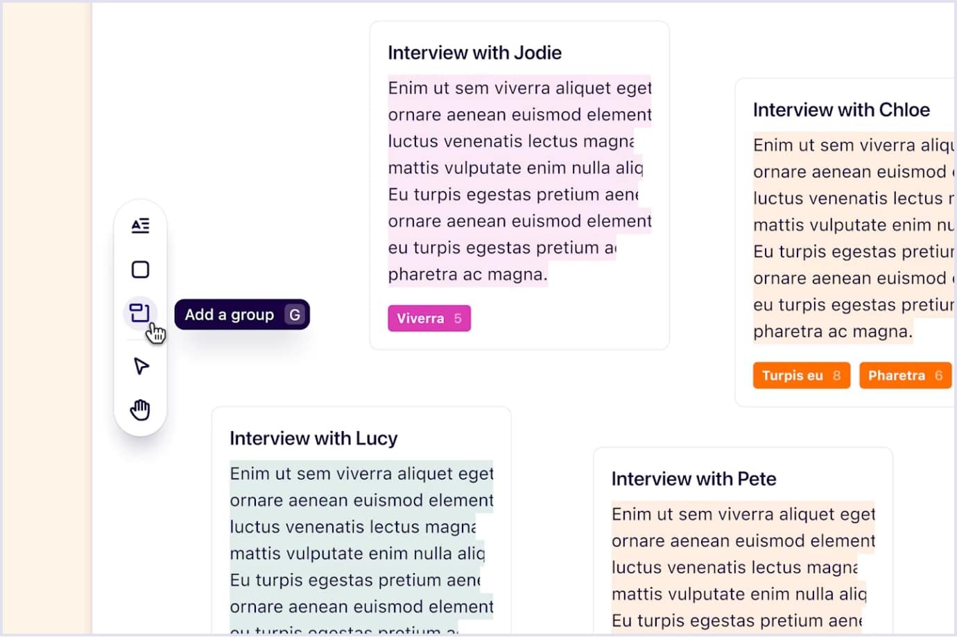
- Choose from the best navigation patterns. For example, the horizontal pattern is considered the most intuitive one. If you need to include more items in the menu, use vertical navigation, allowing scrolling. Finally, if your SaaS platform embraces complex functionality, you can combine both types. For example, Dovetail uses a vertical sidebar menu to manage objects in their canvas.
Source: Dovetail
Dashboards
A dashboard is the first thing when a customer starts with SaaS. It helps to view information on the current key performance indicators (KPIs). Thus, a customer gets a full view of tasks and the efficiency of completing them.
Also, the dashboard design will have better usability if you include sorting by date or by selected KPIs. This is a must for the convenient display of information and working with metrics as a whole.
For instance, Mixpanel is a tool that helps you analyze users’ actions with your app. Mixpanel presents the necessary dashboard KPIs to help monitor key user engagement parameters. The KPIs include customer conversion, followers, retention, and posts on social media.
It is helpful to include in the dashboards the list or chart of events that happened while the customer was away. For this, you can include timestamps and headlines of the news. Also, you can add to-do lists to help users to follow and complete their tasks.
Problem zones should also be outlined. A list of alerts arranged by importance will greatly help when using complex applications. You can make alerts actionable and dismissable, ensuring that customers check for them.
SaaS personalization
Personalization means providing product experiences based on the features users apply. For this purpose, you may collect customer data. Personalization aims to provide the best user experience. Let’s see some examples showing how you can enhance work with your quality SaaS.
ClickUp is a great example of interface personalization. Customers can add and remove features from the SaaS UI based on their needs. For example, users can tune up functionality by turning on and off the options. Such options can also depend on the pricing plan a customer chooses.
Another way to personalize a website is by filling in empty states. An empty state is when a user signs up for your product, and there is nothing to display. The vital aspect is that an empty state should not be empty. That’s because this UX component helps you acquire, onboard, and convert users.
Empty states help customers to learn about your product. You can allow users to replace empty states with relevant information. Also, this approach lets you show customers the value of your product quickly, reducing time to value.
An excellent example of using empty states in design is Todoist. After logging in, a user gets clear instructions from Todoist on using the product with a series of short videos and comments.
Empty states are also excellent engagement tools. When you manage to complete all your tasks in Todoist, the empty state page shows a congratulatory message.
Customer support
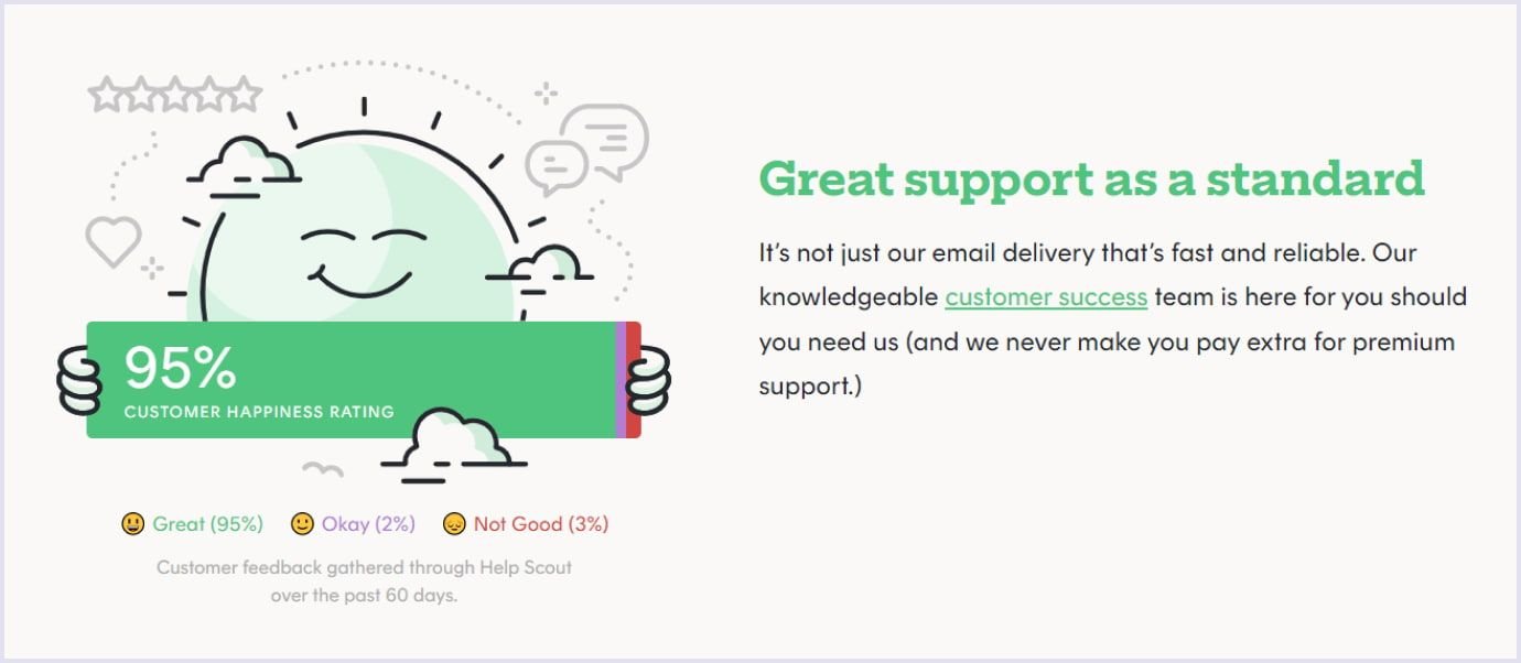
Your product is perfect in UX/UI. Still, users may have questions on their journey with your SaaS website. For this, provide comprehensive support for customers to help them get on with your functionality. This is especially useful if you offer a free trial.
It should be easy to contact the company’s support team through a chat window. Creating a chatbot to solve the most typical issues is a common practice.
Some customers choose to solve the issues on their own. For them, you can include a FAQ section on the SaaS website. It will also help to streamline the customer support process by filtering easy-to-solve problems.
Source: Postmark
Customer support on your SaaS website is a powerful tool. It will help you get users' feedback and improve your SaaS application.
Also, it is advisable to include the About Us page along with contact details. Users can learn more about the company in it. Pictures of professionals working on software as a service appeal to users. It helps to know the real people behind the SaaS product and builds trust in the company.
Continuous upgrading of SaaS design
As you gain a more extensive user base, your product will grow and evolve in functionality. So, you will need to adapt your UX/UI design to the expanding business scale. Social media and regular surveys on the website will help you discover what is valuable in your solution for users. Therefore, you will know how to align the design with your adopters’ needs.
An important note here is that you should email or send notifications on the updates you make. This will help your customers quickly grasp what has changed and keep using your app.
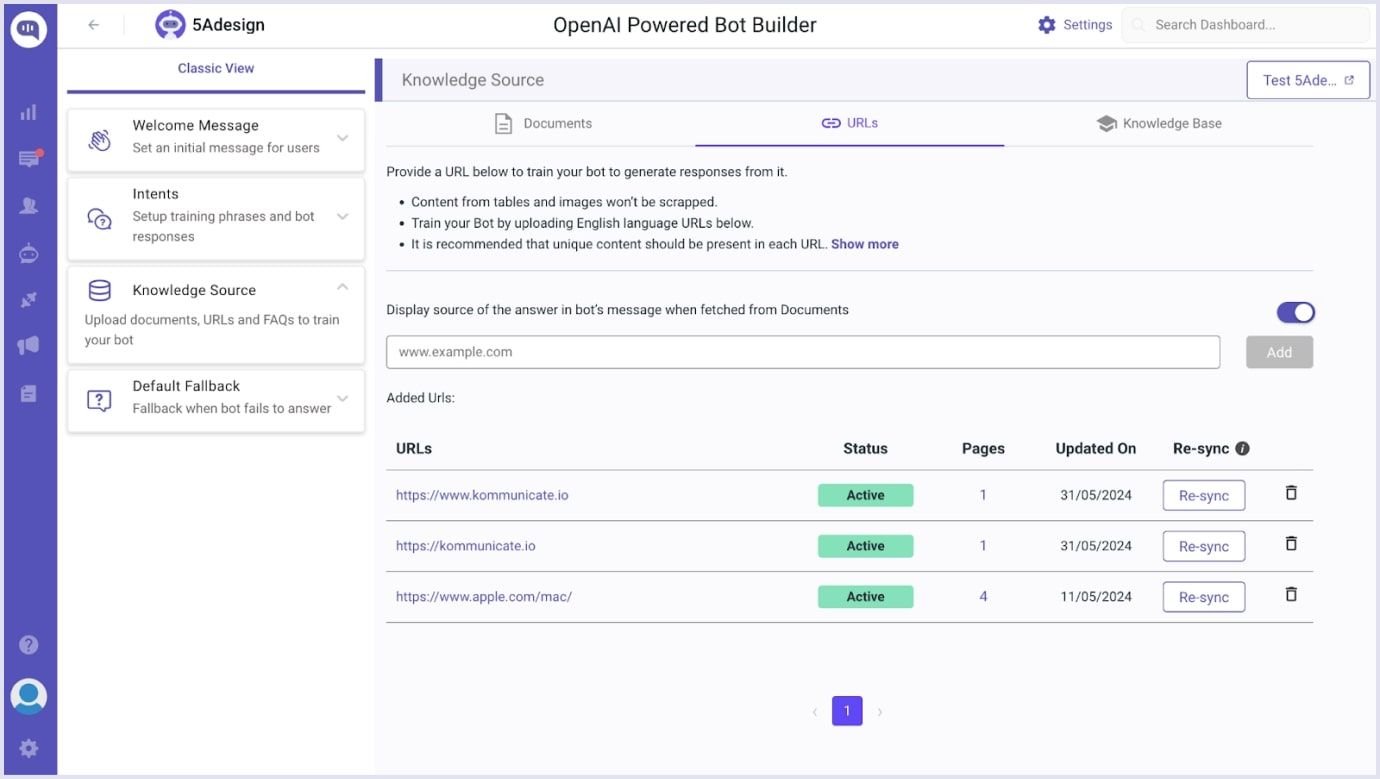
For example, Kommunicate presented its AI-powered bot builder with step-by-step instructions on how to create and train it on its platform. Regular updates from Kommunicate on their website help users get the most out of this tool.
Source: Kommunicate
Accessibility features
Designing with inclusivity in mind has become a standard for web solutions, including SaaS. However, you do not need to overhaul your SaaS app’s design to make it accessible. Start small with a few changes, see how they resonate with your customers, and proceed based on their feedback.
To start with introducing accessibility into your SaaS app, check out the following aspects:
- Check for a general accessibility overview for your design. The Web Content Accessibility Guidelines (WCAG) provide a concise overview of basic accessibility features in design with Easy Checks. So, you can spot what to adjust in your SaaS solution.
- Choose colors and color contrast. Colors are meaningful and helpful when chosen wisely. They convey your brand identity and help people with different abilities interact with your SaaS.
- Use accessible tools for actions. As people use a mouse, they also should be able to perform the same actions with the keyboard. For example, Salesforce uses its Click2Create pattern and allows users to search and navigate email lists with the keyboard in addition to the mouse.
- Co-design with those who experience exclusion. You can gain insights on how to make your SaaS app more accessible by asking those who use it with screen readers and keyboards or have other needs. Knowing those needs, you can adapt your SaaS app and make it more user-friendly.

How to design SaaS
Custom SaaS development is a versatile process that involves many parties and questions to be answered. Below is a description of how the SaaS design process should rely on the best practices and what aspects it should involve.
Product discovery phase
Designing SaaS UI/UX starts with the product discovery phase. This commencing point involves stakeholders, a designer, a developer, and a project manager. They discuss the crucial business aspects of the future solution. Product discovery sessions help answer the following questions on the design for SaaS:
- What are the project goals?
- Who is the target audience?
- What is the core functionality?
- How should the cloud solution be designed?
The video below shows in more detail what product discovery is and what stages it covers.
A designer starts delivering UI/UX design services for the future project at this stage. The designer gets information on the crucial business goals and customer needs. So they can understand what functionality should be included and how it should be formed in the hierarchy. Thanks to the discovery consultations, the designer can start creating the solution.
The process of designing a SaaS app begins with making wireframes. These are the first sketches created by hand on paper showing the preliminary positioning of UX design and UI elements. Wireframes provide several options for the same feature or component. For example, it can offer several position variants for a sign-up button.
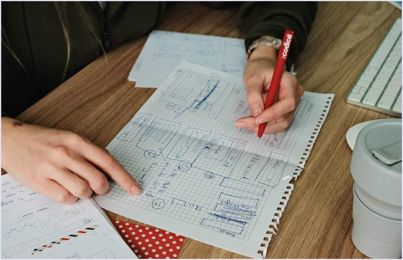
Wireframes don’t need to be neat. Instead, they should offer a series of possibilities for elements, fields, and user flow options. Thus, the designer can select the best one after relevant discussions with the client and developer.
UX prototypes
After choosing suitable options for the elements, the designer starts creating prototypes. They represent the position of buttons, fields, and flow of the website, excluding colors and visuals.
After creating the first version of the prototypes, the designer discusses them with the technical team, project manager, and client. This helps to select the proper structure for elements and remove unnecessary ones.
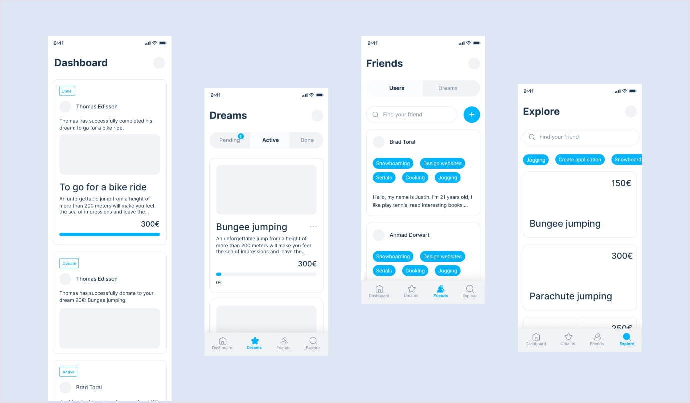
Prototypes are clickable and simulate the structure of the real solution. Yet they lack one crucial thing, which is the visual part. It is added at the stage of creating UI design.
UI design
After building the solution structure, it is vital to create an appealing look that would delight users. Your brand's style is brought to life with the color palette that the designer chooses. The SaaS UI includes the following elements:
- Colors;
- Fonts;
- Icons;
- Interface elements (modal windows, fields, buttons);
- Pictures and videos.
The solution interface should include those elements to make it easy for users to move through the SaaS app and find the needed features. At the same time, the cohesive and intuitive placement of UI components helps users perceive your software as a whole.
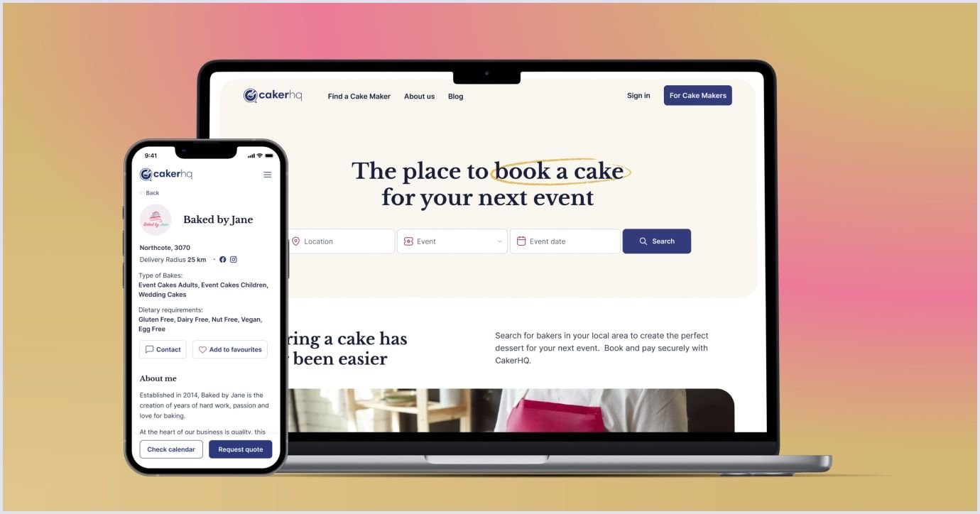
Below is an image of the desktop and mobile design of CakerHQ, a SaaS platform for bakery businesses. Designed with contrasting and vivid colors to highlight the festive spirit, it also provides a convenient functionality for ordering baked goodies.
Moreover, you can better understand the entire mobile app development process by reviewing our detailed guide.
Codica’s expertise and advice on SaaS design
Our team has reach experience in designing custom software solutions, including cloud products. When designing a SaaS product, we recommend our clients start by developing an MVP (minimum viable product).
The SaaS MVP holds the set of essential features sufficient to roll out your product to the market. As an MVP is an early version of your product, it must delight users with smooth UX design and appealing UI. With minimum viable product development services, you can also add new features to improve your solution.
That is why we rely on recent and proven trends and best practices to deliver convenient and vivid solutions. One of our works is the SaaS solution for real estate. The outstanding feature of this portal is 3D tours that help users view the property before going onsite.

The platform's design also includes other features that help connect homeowners, agents, and tenants. For example, we created a convenient form allowing input of all the property details.
Also, we built a search with filters. We included small icons that indicate specific parameters of the chosen property, such as the garden, balcony, and parking.

The design of this cloud solution relies on the best principles of usability. So, it helps users to list and view properties and assists in communication between homeowners, tenants, and agents.
Check our portfolio to see more designs from our team.
Also, we would like to share the main principles that we recommend applying in your cloud design:
- Create an easy-to-read and appealing landing page;
- Include primary features in the menu bar;
- Use a background that matches your font and graphics colors;
- Simplify the registration process;
- Focus on a single target audience;
- Upgrade the cloud software design;
- Create a design that performs equally well on desktop and mobile versions.
We hope that our pieces of advice will be helpful when you decide on the design for your cloud software.
Related reading: Minimum Viable Product Design: How to Build a Successful MVP
The elegant SaaS design works best for your business
Let’s sum it up. The best practices and trends in SaaS product design allow you to create a better user experience. If you think about the usability of your solution, people will be glad to stay with it. Thus, customer acquisition and conversion rates will be higher, which will benefit your business.
The core principles are to make the design appealing and straightforward. Also, it is vital to move through the main design processes, from discovery to wireframes, prototypes, and UI design.
If you need a clear and well-thought design for your SaaS, contact us. Our design team has rich experience and is eager to bring your solution to success.

