E-commerce is a method of selling and buying goods and services online. For this, vendors use websites as crucial tools to drive sales. So, making an ecommerce website attractive and convenient is vital for a positive customer experience.
Regarding the versatility of online store products, it is essential to showcase them in the best way. That is why ecommerce website design involves details to make the shopping experience as delightful and secure as possible.
This ecommerce website design guide discusses the critical points that will increase conversions. Our designers eagerly share their expertise to help you win with your ecommerce site design and attract more shoppers. Let’s get started.
Design e-commerce for trust and security
The essential thing in designing an ecommerce website is to make it trustworthy. A common shoppers’ concern is whether their data are protected and the transaction is safe. If a website is insecure, customers search for another place to shop.
How can you use design to translate that your website is safe? Here are several tips.
Provide a background of the business. It can include the following elements:
- General information;
- Photographs of people working in the store;
- Contact details;
- Links to social media;
- Frequently asked questions (FAQ) page.
Include the store policies. They may cover shipping, return, and privacy policies with shoppers’ personal and financial information. Ensure they are easy to find and understand.
Share product ratings and reviews. This information is crucial for shoppers to understand what the product is like. The experience of other visitors who bought the item is valuable for safe buying. You can add information about reviewers or summarize the reviews. Thus, you bring more benefits to users.
Use a secure server. Customers expect safe processing of their personal and financial information when using the website. Use SSL (secure sockets layer) certificates to ensure safe authentication and sensitive data encryption. You can use the relevant security badges showcasing the security tools you use on your website.
Add acknowledged trust seals. These tools validate the legitimacy and safety of a website. Some trust companies put an additional protection layer. So, if the transaction turns out to be fraudulent, a shopper gets insurance. Trust seals increase conversions as shoppers know the store's safety.
Show attention to small things. Details bring the overall impression that a website is trustworthy. Avoid typos, broken links, missing images, error pages, and other mistakes.
E-commerce website design best practices
Depending on your customers’ needs, you will design your website. Still, there are basic principles following which you will improve shoppers’ experience and engagement. The following are essential elements that make an ecommerce website convenient and trustworthy. So, companies use them when providing ecommerce website design services.
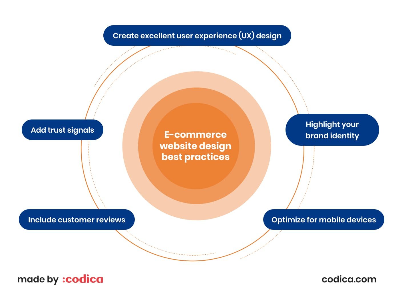
Create excellent user experience (UX) design. A customer-centric design is simple and easy to follow for all demographic groups. Make your navigation simple, and add auto-filling and filters to your search. As a result, shoppers will immediately find what they need.
Highlight your brand identity. Your website presents your brand. The design allows you to convey your brand story and stand out among your rivals. Ensure your logo, colors, and fonts are consistent across your website to make your brand recognizable.
Optimize for mobile devices. Regarding how mobile devices penetrate our daily routines, creating an excellent mobile-first design is vital. The better your mobile design, the more likely shoppers will return to your store. Test your website thoroughly on all screen sizes before launch.
Include customer reviews. Feedback from those who bought a product is a valuable source of information for future customers. This feature allows shoppers to make informed decisions on buying an item. Customers value such information, meaning a positive experience with your store.
Add trust signals. When visiting your store for the first time, shoppers check if you deliver quality service. Making specific information available to users, such as support, return policy, and privacy terms, ensures that customers will trust you more. Security badges also prove that shoppers’ data are protected.
You may also like: Major Principles for a User-Friendly Website You Need to Know
The importance of frictionless e-commerce site navigation
Website navigation is the primary structure and the foundation of the best e-commerce website design. Generally, these are links that lead to different pages across the website. Primarily used in the header and on the side, the links show how the website works. They lead shoppers and show where they can get the relevant items.
Let’s see how you can create navigation that facilitates selecting and buying items.
Well-defined product categories
Starting with your ecommerce website, shoppers would need a clear division of your products into categories. Such classification makes it easy for customers to find what they need. After getting the first impression from the website, shoppers want a prompt understanding of where the required item is. So, the division into categories should be clear and relevant when designing for e commerce.
Also, making category and subcategory descriptions as concise as possible is a good practice. It will facilitate product scanning for shoppers and help them with product searches. You should thoroughly test the category and subcategory division as it is a crucial point of the website user experience design.
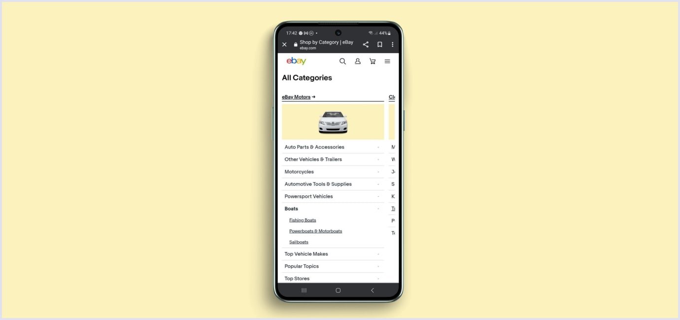
For example, in mobile design, eBay uses swiping and dropdown menus to organize their categories. Thus, they make category lists more compact and accessible for users. You can tap a category on your smartphone and select the necessary subcategory among many dropdowns. The image below shows the look of eBay Motors' categories on mobile.
Product search
Shoppers turn to the product search when they do not find an item on the current page or know what they want. The better this engine results, the more likely shoppers will purchase on your website. Below are the tips on how you can improve the search in custom e-commerce website design.
Locate the search engine in the most visible spots. Put the search on different pages and in locations that are easy to spot for shoppers. The box should be vivid, recognizable, and simple to use. The pages' top right or top center are common positions to arrange the search, or you can put it on the main menu.
Include different types of queries. It is helpful for shoppers if they can type any query in the search. You can incorporate the search of specific items, categories, subcategories, properties, and customer service information. To give a hint for users, include a placeholder or sample text in the search field or below it.
Add search auto-complete features. Auto-complete functionality makes the search easier for shoppers. Also, auto-suggestions help to find a specific item if a shopper is unsure what term to use. Thus, you raise the sales potential for the categories related to a shopper’s search.
Enable sorting of the results. Allow shoppers to group and look through the items based on specific criteria. These can be the newest items or bestsellers. Also, suggest filtering by size, color, product rating, and other item aspects.
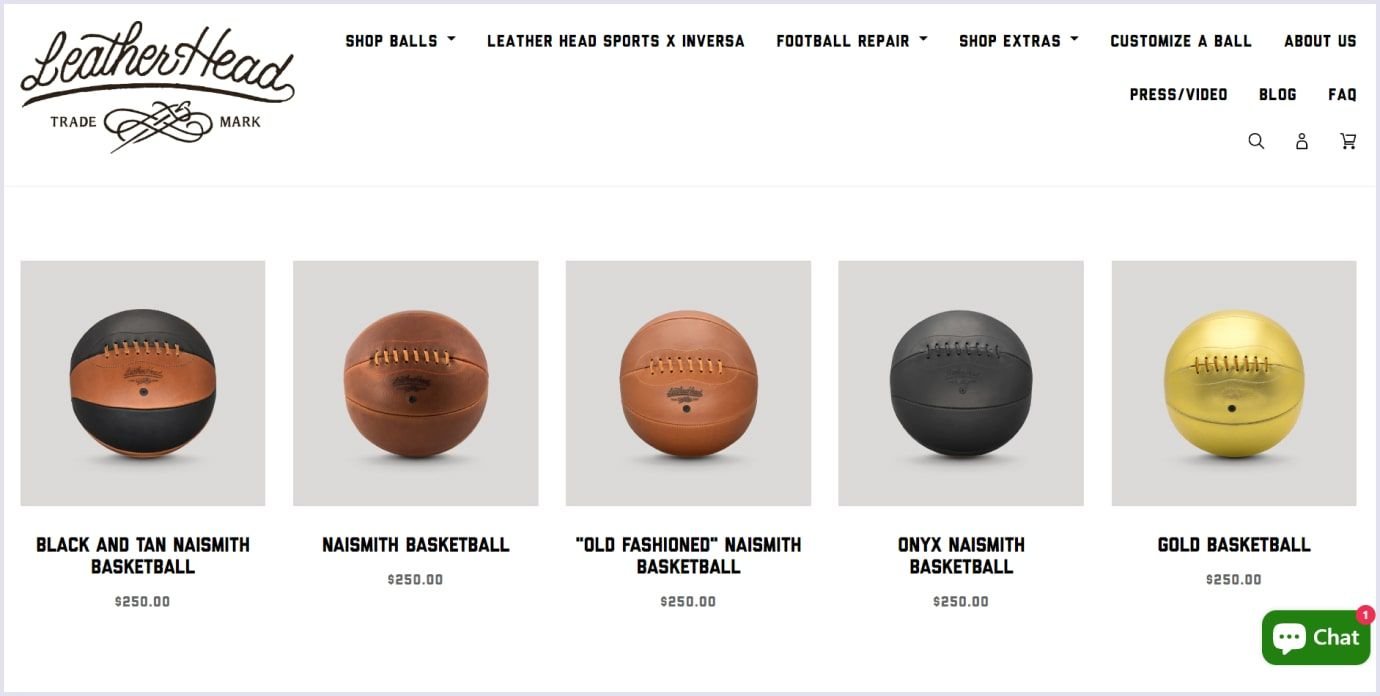
For example, this is how the product search results look in the Leather Head store selling retro balls for different sports. The results give a full view of the store's basketballs in stock.
Filtering products
Applying filters is another method to simplify the search for shoppers in webstore design. If there are many similar products, a customer might need clarification, not knowing what to choose from the variety. You can help them with filters. Allow shoppers to select items by specific parameters. This way, it will be easier for them to choose products.
A vital point in the case of filters is to make them easily accessible for shoppers. For example, you can use a sticky bar attached to the top. It can be present all the time or appear when users scroll up. It is best to show off the options straight away. On the other hand, stores with vast product lists combine accordions and scrollbars or menus with dropdowns.
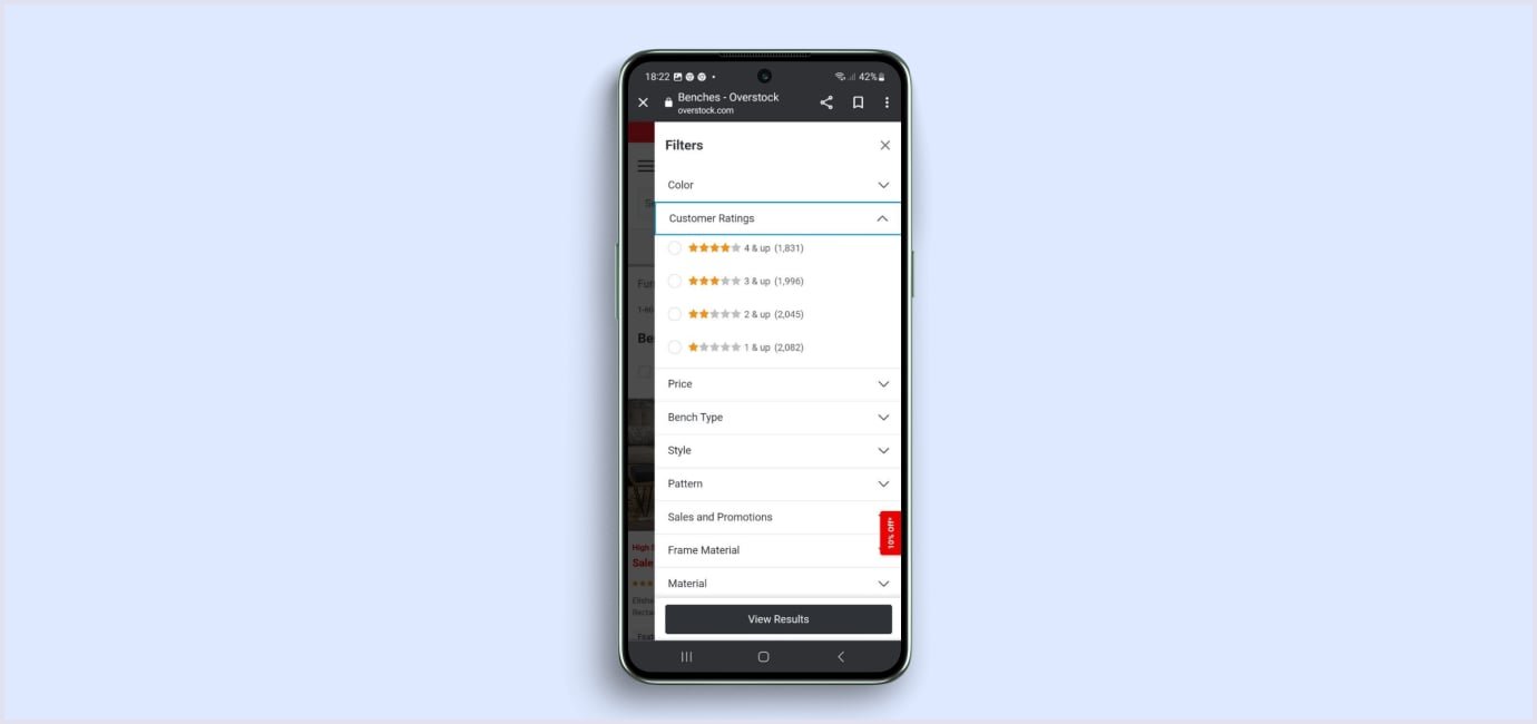
Another option is using dropdowns. For instance, the Overstock store suggesting home items uses dropdowns to allow shoppers to view filters. Users can also deselect the filters to sort things by other criteria.
Product quick view
This feature allows shoppers to view the product details without going to the entire product page. This way, users can view particular product details and add products to the cart while they browse the product list. The product data are typically displayed in a modal window over the product list page in the center. This is the most comfortable position for better usability.
For example, Urban Outfitters use quick views to present their products promptly. You need to click ‘Quick Shop’ on the product image, and the window will open.
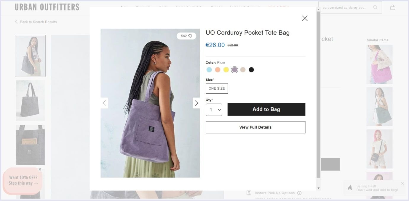
Quick views are helpful as they enable shoppers to find the right product without leaving the product list page. So, this feature saves users time and effort when selecting items. According to Baymard, you should consider some more peculiarities when using quick views. Here they are:
- Quick views benefit websites where products can be assessed with a few attributes. For example, apparel and supplement industry websites can benefit from this function.
- If you use quick views, enrich those windows with the ‘Add to Favorites’ and ‘Add to Cart’ options. So shoppers can save and order products faster. Also, users often add items to the cart for comparison after they narrow down their options to 2 to 3.
- Ensure the ‘Back�’ button in the quick view window returns users to the product list. This facilitates resuming the search for them.
- In the mobile version, the quick view should not be mistakenly taken for a product list. For this, arrange the quick view window so the product list is visible behind it.
- Quick views are unsuitable for specification-driven products like computers and washing machines. A quick view window cannot accommodate all the useful features for shoppers.

Special offers
As shoppers always look for discounts and the best deals, it is reasonable to highlight them on your website. Even if a discount is not that big, a shopper will get a sense of saving and winning from the offer.
How can you make your special offers more visible? Here are a few tips for special offers in website design for ecommerce:
List discounted items in the sales section and appropriate categories. So you help shoppers find discounts within their area of interest.
Highlight site-wide promotions globally throughout the website journey. Suitable areas for showing promotions are hero space on the homepage, product listing page, or the shopping cart and checkout pages.
For example, Tula uses the header area to highlight free shipping. Also, the website outlines the sale offer above the price and a discount on the right side of the product page.
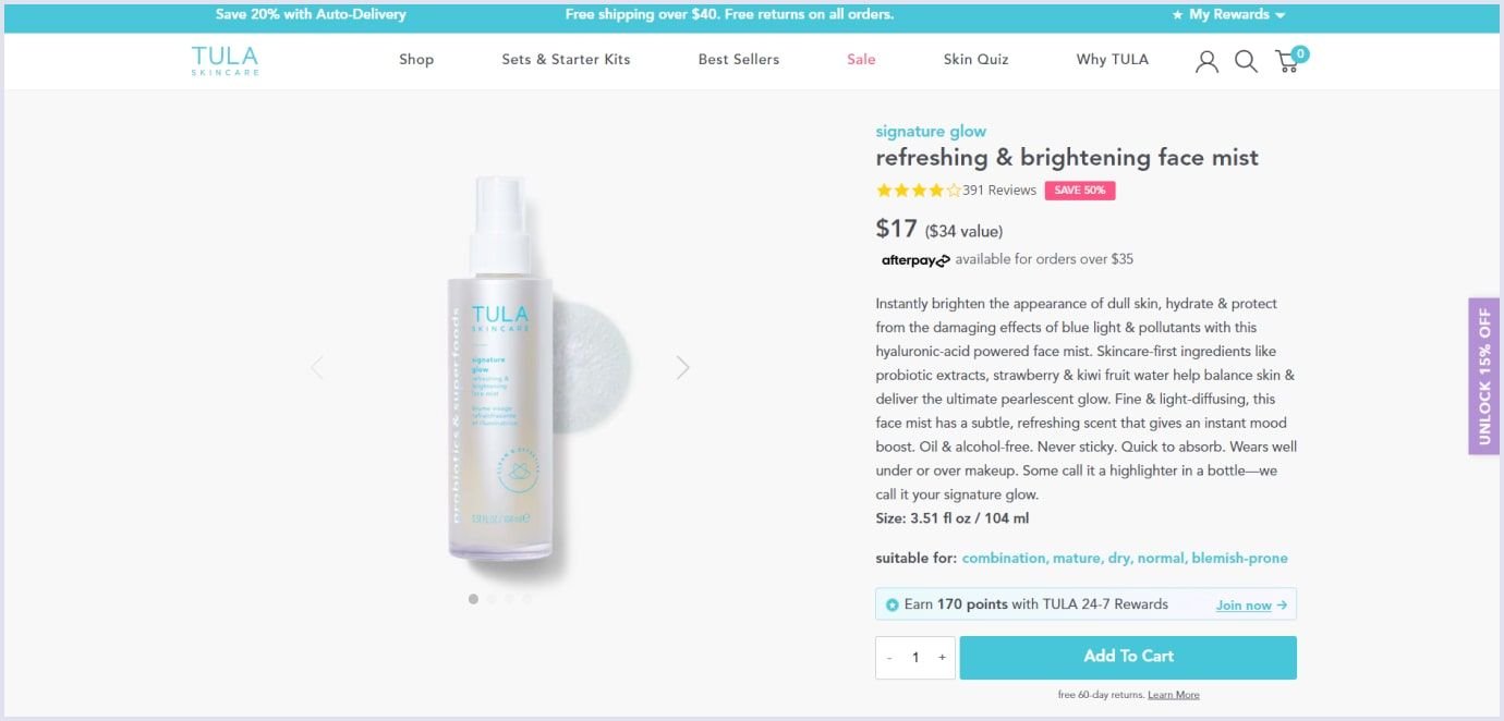
Do the math for free shipping discounts. It is convenient for shoppers if you show how much they should buy to qualify for the offer.
Show how users can qualify for product-level discounts. If your special offer applies to a certain quantity of items, highlight the offer near the total price and in the banner below the product photo.
Remind of special offers when shoppers proceed to the shopping cart. Adding discount reminders to the shopping cart encourages customers to add more items to the bag.
Be clear on the offer limitations upfront. Show such restrictions in a concise and transparent form. Thus, shoppers will know what to expect from the offer.
Further reading: Website Redesign: The Complete Guide and Recommendations
E-commerce product page design
A successful web design for ecommerce helps shoppers to learn more about the found product. The best practice for ecommerce websites is to outline the relevant product information as much as possible. This approach provides customers with a shopping experience similar to in-person buying. Let’s look at the most crucial points to improve your users’ experience.
Excellent product images
Customers cannot touch, feel, or try the products online. Their choices depend on what they see in the e commerce website design. That is why adding product images that fully present the item is vital. The following are the best approaches to making perfect product images:
Use a light background. The background should not divert attention or compete with the product. The neutral background highlights the product and complements any style or color scheme.
Make vivid and high-quality images. Perfect images increase sales. Excellent images catch shoppers’ attention and present the product from all sides. Ensure that shoppers can zoom up images to see products in full detail.
Showcase your product from different sides. Images from various angles and close-ups give shoppers a complete sense of the product. Customers can get a more precise picture with a 360-degree view. The next level of this method is to provide virtual reality elements to show the product in physical surroundings.
Apply video. It helps to highlight how the item looks or works in a short amount of time. With video, you can highlight much of the functional information.
Be consistent. Use images that correlate with each other and align with your website style. So your product lists and pages look neat and spare. The central product image should be the same across various site sections, such as highlights and featured item areas.
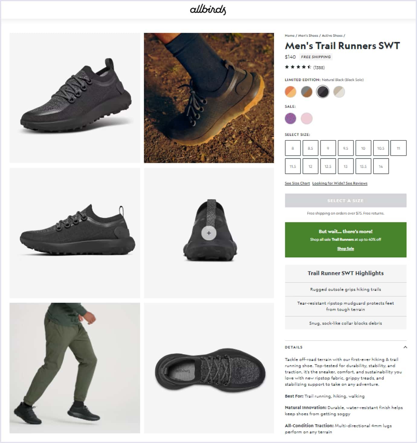
For example, AllBirds outlines its products with high-quality images from different angles. Also, the store applies a video showing how the trail runners feel. Explicit product color lists, sizes, and detailed model descriptions add to the overall design quality of the product page.
Provide just the right product information
The product description, size, color, material, and other relevant information give a full view to a shopper. The more data you provide, the fewer questions users will have and the easier for them to make an informed choice.
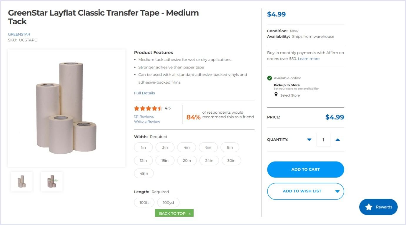
For example, USCutter is a B2B company providing a full description of its products. As the company’s customers search for specific sizes, the product description gives a full view of its properties. The page includes product specifications, such as width and length. Also, customers can look up the reviews and learn how many shoppers would recommend the product.
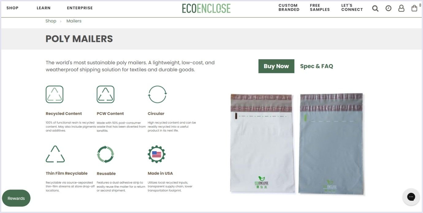
Another excellent example is EcoEnclose, a manufacturer of 100% recycled poly mailers. Their product page showcases the standards following which the company makes its poly bags. The description outlines compliance with the best environmental standards. So, shoppers know about the company’s sustainable products with weatherproof, lightweight, and low-cost properties.
Employ persuasive design
This approach means appealing to shoppers’ emotions and encouraging them to take steps to increase sales. Several techniques create a persuasive design. They are as follows:
- Giving users control over their choices, such as the ability to sort products by specific parameters;
- Creating a step-by-step workflow that helps a shopper to go through buying and finish the purchase;
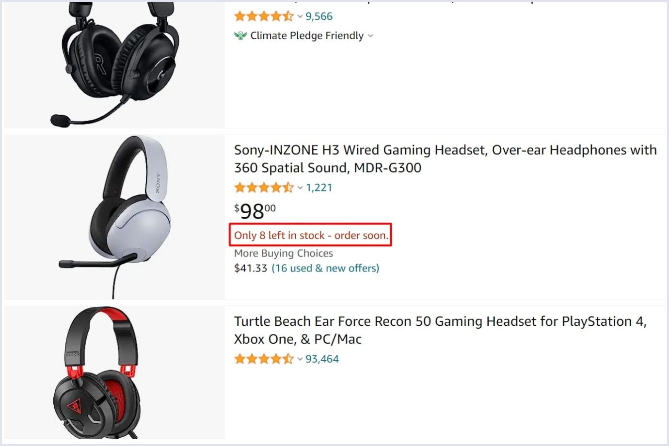
- Showing the scarcity, like showing few items left, putting sold sizes in grey, or highlighting sale deadlines;
- Using testimonials or reviews from people who purchased on the website with a positive experience in design.
For example, Amazon shows the remaining items. This approach encourages users to buy thanks to the scarcity impression.
Along with analytics, user research, empathy maps, and other tools, designers can make the most of persuasive design. Using shoppers’ psychology with a thoughtful approach and the right research brings an ecommerce website design to a new level. Thus, designers can deliver a better user experience and contribute to conversions.
Show related and recommended products
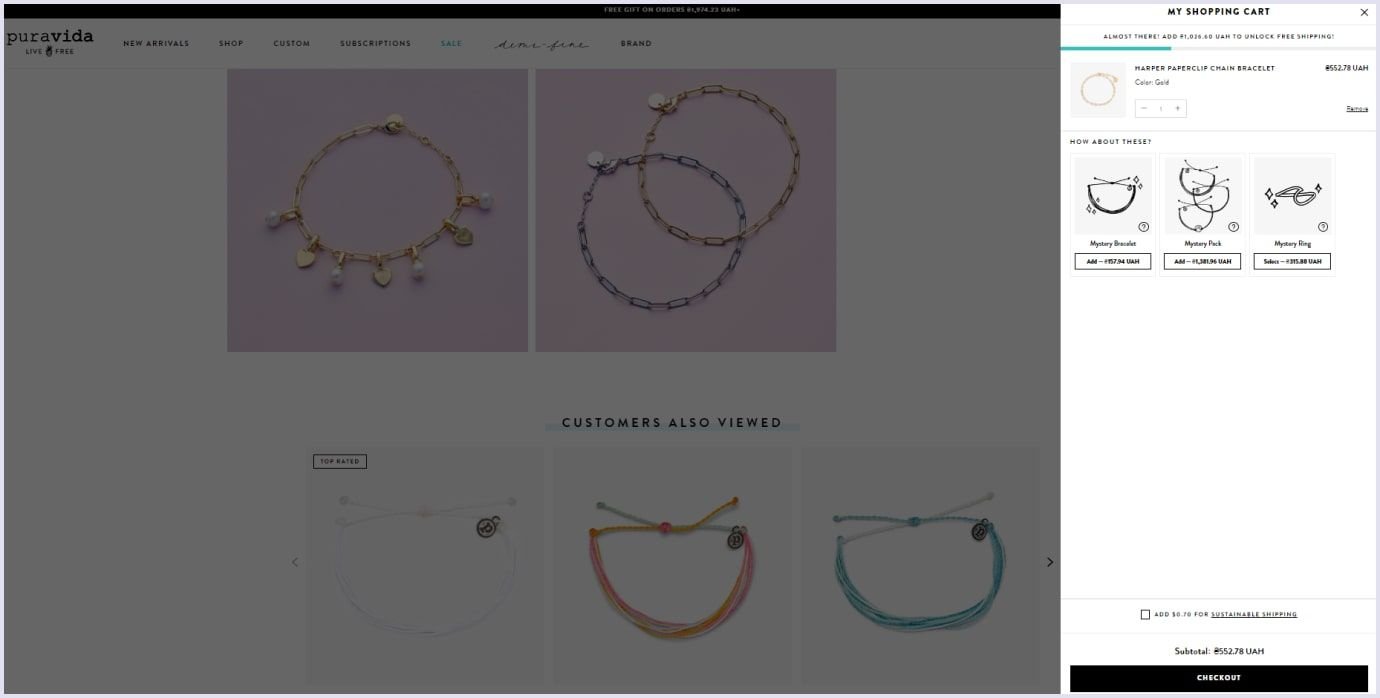
When shoppers select products, suggesting similar or complementary items is helpful. You can display related products on the product detail page or the shopping cart. These suggestions may resonate with shoppers’ intentions and end in a shopper adding more items to the cart. Thus, you will provide an excellent experience and meet users’ needs.
For example, Puravida added a section showing items viewed by other customers when selecting particular products. The store added suggestions on product pages and in the shopping cart.
Shopping cart design
Statistics for shopping cart abandonment in ecommerce show 70.19%. Among the common reasons for cart abandonment are the following:
- Excessive additional expenses, such as tax and shipping;
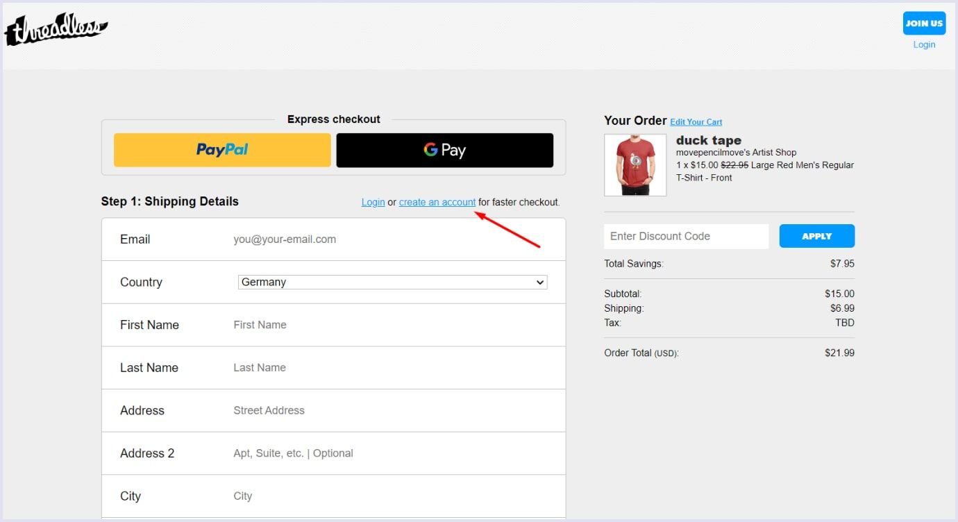
- Urging users to create an account on the website;
- Too long or complicated checkout process;
- Not transparent costs;
- Website crashing;
- Limited payment options.
That is why providing a smooth user experience with thoughtful design is vital.
A shopping cart is where users view their items and proceed to checkout. The shopping cart should cover essential features that encourage users to finish purchases. So, how can you make the shopping cart design user-friendly? We discuss it in detail below.
Apply a vivid call-to-action (CTA). The main call-to-action in the shopping cart should be the checkout button. Make it easy to note with bright and accent colors and typography. Use convenient clickable areas and plain language for better visibility.
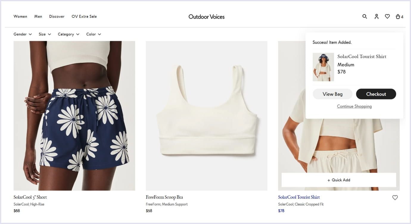
Provide straightforward product addition. Ensure the item is confirmed and shown in the shopping cart when a user adds it. Undistinguished feedback makes shoppers confused and frustrated. For a better user experience, you can provide transparent messages or use animations to attract attention.
Use a mini cart widget. Using a mini cart allows shoppers to add items to the cart without leaving their current page. The widget also allows users to search for other products and add them later. If you link this widget to the shopping cart page, a shopper can jump from searching to finishing the purchase. Below is how Outdoor Voices implemented this widget on their website.
Show item details. When you show product details, such as name, size, color, and price, shoppers can easily change items if necessary. It is helpful to link products in the cart to the relevant full product pages. Thanks to this, visitors can review the product details and compare items.
Make cart editing easy. It should be easy for shoppers to manipulate the items and their details. So, ensure the shopping cart allows shoppers to save items for later or change product details.
Be transparent on the shipping costs and taxes. If users discover additional expenses on their purchase journey, this may impair their experience. An unexpected increase in price causes disappointment and abandonment of the cart. The price, shipping, and taxes should be transparent upfront.

E-commerce checkout design
The last step when a shopper completes the purchase is checkout. At this stage, the customer completes the shipping, billing, payment method, and other details to finish buying. Make sure that this stage is simple and free from hidden requirements. So users can complete the checkout process rather than abandoning it.
Below, we discuss the essential aspects that will help you keep the checkout design convenient and stress-free.
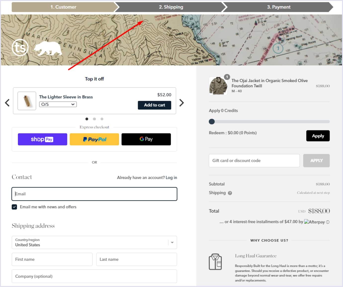
Make the checkout process simple. Use essential fields and steps to finish a purchase. Also, you can minimize the process by using the shipping address as a billing address by default. The ecommerce design with a one-page checkout is perfect. Add it up with the ability to view and edit the cart and payment options.
Suggest different payment methods. Customers have various preferences when it comes to payments. Offer as many solutions as possible depending on the target audience’s leaning. By making payment easy for shoppers, you can expand your customer base.
Offer guest checkout. Forcing visitors to register at their first purchase can prevent them from finishing the checkout process. Suggest to them a registration option after the purchase is complete, highlighting the relevant benefits. For example, you can outline that the checkout process is easier for registered users because personal information is stored in the system. Also, you can show that registered members have special discounts.
Use clear error explanations. Not being able to complete the checkout process makes shoppers frustrated. So, it is sound to show errors in real-time instead of after the customer completes the forms. You can place the concise and straightforward error message directly near the field to be corrected. Thus, users can understand what they should repair.
Show shoppers the track of steps. This aspect is especially vital for multi-page checkout sections. Place a progress bar outlining how many steps have been finished and the steps left. This way, a shopper gets a clear picture of how many steps they must complete. In the end, show the order confirmation and shipping tracking status to avoid ambiguity. So users know that they reached the end of the checkout process.
Suggest support. Add a live chat or contact throughout the checkout process. Thus, shoppers can receive immediate help. It will keep them on the site and help them complete the purchase.
Best ecommerce website design examples
Designing an online store is part of the brand strategy. Such an approach helps them provide a smooth user experience and establish strong customer relationships. For this, ecommerce websites combine the best practices and recent design trends. Let’s view several examples that present an excellent brand design.
Black Diamond
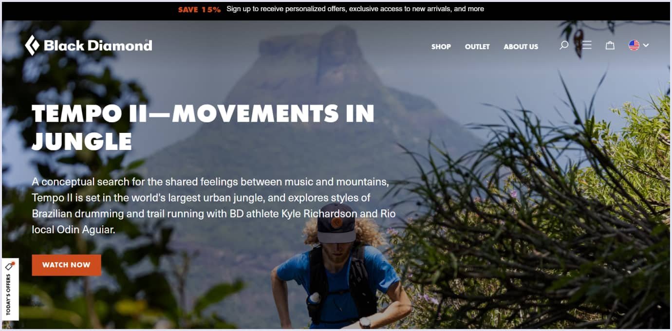
A group of climbers and skiers established this store, providing the same equipment since 1957. Their website highlights apparel, climbing and skiing gear, and protective equipment. The design sparks thanks to the following approaches:
A white background. It flashes the products of different styles and colors. Also, the white background does not interfere with product images and allows you to see them vividly.
Stylish presentation of the products. The website uses stunning images and videos. Types and broad categories list the items - for example, apparel, trekking poles and packs, carabiners, and climbing helmets. Also, you can choose between the men’s and women’s collections and search these broad categories for specific items.
Black background on the bottom. The black section at the bottom of the starting page presents additional information about the store. For example, it highlights local dealers, free shipping, gift cards, and ways to join the community.
Trade A Boat
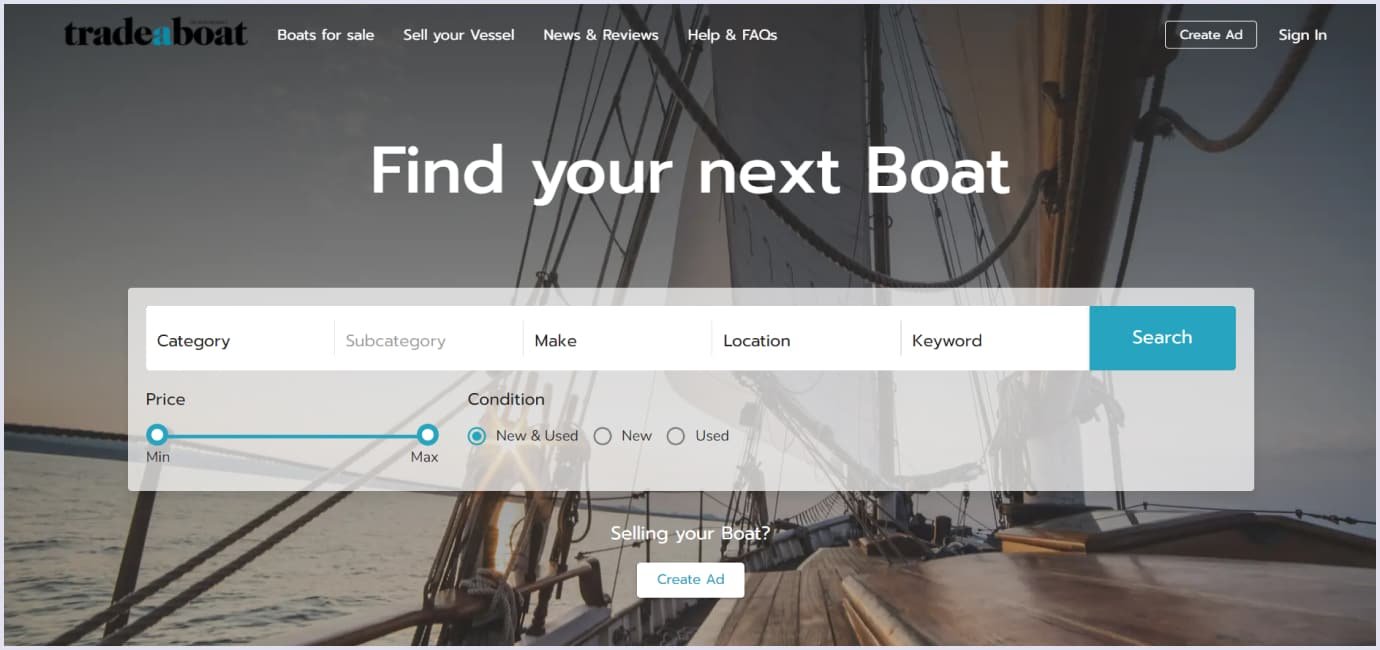
We created this marketplace for boats using the best ecommerce web design standards. The platform allows amateurs and professionals to list and sell marine vessels and equipment. The following specifics make this platform an excellent place to sell and communicate on boats:
Convenient product page. The product page lists the necessary information, such as item price, location, category, and condition. There is an option to get a quote for payment in installments.
Filters to search specific items. The boat-selling website holds a menu on the left side where you can choose products or categories. Filters sort items by categories, make, model, location, year, and more. So shoppers can choose a filter if they want particular boat or equipment specifications.
Product suggestions. The platform offers items that users may be interested in. For example, you can choose pieces from the featured list or the newly arrived items.
Welly
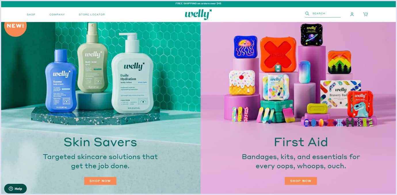
This store serves children to provide safety while they interact with the environment. The website provides bandages, safety kits, and first aid support in various colorful schemes. The store design stands out thanks to the following characteristics:
Presentation of products by types. Hovering on the ‘Shop’ opens the dropdown menu with all categories offered on the website. If you are unsure what to choose, the design suggests recommended, bestsellers, and new products.
Colorful product images. The product is oriented to a bright scheme. So is the website design. When you hover over the bandage pack image, it shows how the bandages inside the box look. So shoppers can choose the best products among varieties.
Codica’s expertise in designing ecommerce websites
Regarding ecommerce, we understand how vital user experience (UX) and user interface (UI) design are to brand image creation. Website for online stores is the primary tool for building strong customer relationships. Once delighted with the store, a shopper will return or recommend it to family and friends.
That is why our designers apply their expertise when delivering UI/UX design services. So, our team creates the design that helps shoppers navigate the web store. Our design team thinks through the menus, arrangement of items into categories and subcategories, putting filters, and more. We organize the general flow so shoppers can easily access what they want.
For example, when we created a custom ecommerce solution, one of the goals was to improve user engagement and retention. The task was to create a convenient, secure, and reliable platform for B2C (business-to-consumer) and C2C (consumer-to-consumer) segments.
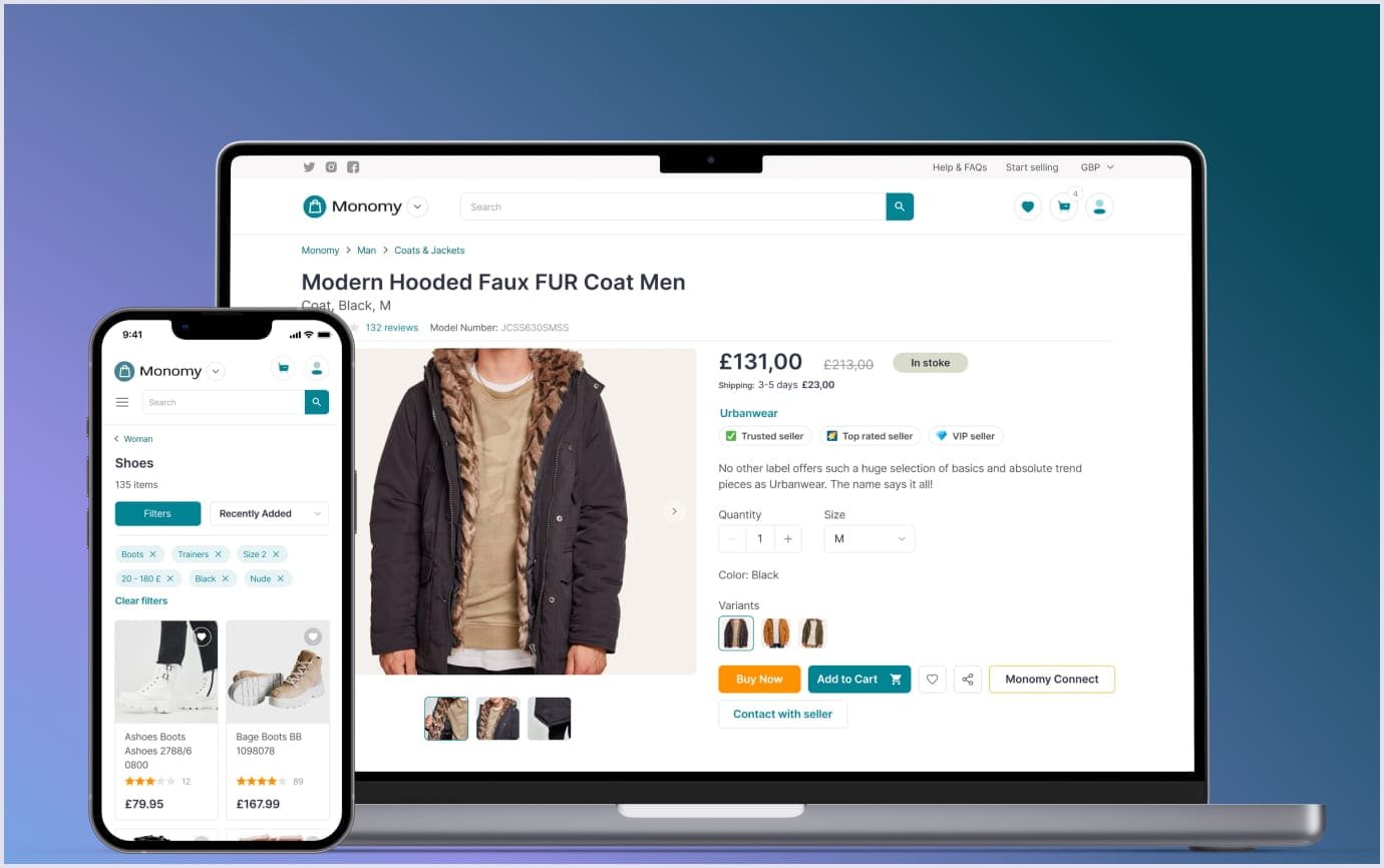
As a result, we ensured easy switching between the platform segments, maintaining high performance. We included a functional search allowing shoppers to look for items by keywords or categories on the website. Also, when on the first page, shoppers can choose the search by categories or look through recently added items.
We added product images that are stunning and informative at the same time. Shoppers can find the necessary information on the product, such as color, size, rating, price, discount, and description. Then, they can add the item to the cart and purchase it.
Also, the platform suggests various services. You can choose and schedule them using the platform planner with calendar and location options.
Thus, this ecommerce solution makes buying as convenient as with regular stores. Users can easily find and purchase products regarding the website’s UI/UX.
By the way, you can check more designs in our portfolio and on Behance.
Key takeaways
E-commerce website design brings comfort to shoppers comparable with in-person buying. Informative product images and arrangement of search and filters help shoppers find what they need. Highlighting special offers also encourages customers to shop more.
Other important aspects are the shopping cart and checkout design. They are the steps where many users leave. The design of these elements should be smooth, easy, and transparent. Allowing users to edit their shopping cart at any stage improves their buying experience.
If you are about to create an e-commerce website design but need help figuring out where to start, we are eager to help. Contact us for details. Our professionals will help you with any question and give you a free quote.

